
Forum
13,711 posts Identified fonts
Posts by koeiekat

Came with the Brother P-Touch 9500 label printer.
Why shout at your friends?

True. But complicated.
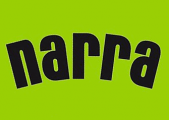
First get the image right. That is 80% of the job.
1. straighten
2. crop away the rubbish
3. backslash 7 degrees
4. minimal perspective correction
Now we have an image that can be matched.
LTS 136pt + 3px stroke width, kerning -10
Match.
First get the image right. That is 80% of the job.
1. straighten
2. crop away the rubbish
3. backslash 7 degrees
4. minimal perspective correction
Now we have an image that can be matched.
LTS 136pt + 3px stroke width, kerning -10
Match.
It behaves OK, no weird effects whatsoever. Maybe ask your client what he means? Maybe when he shakes the paper the letters are falling off 

Identified font: ChunkFive Ex
Identified font: Eight Track

Identified font: Gotham Black

Identified font: Avenir 95 Black

Identified font: Neutra Display

Identified font: Curlz

Identified font: Excellentia in excelsis

Identified font: Portago
I see four different 'a's. That indicates it is not a font.

There is a bit bolder version of the Edition, Long Tall Sally EEN. But not bold enough, still needs an extra stroke to match.
Suggested font: Long Tall Sally
This is not a font but hand drawn. Have a look in the handwriting dept. to find something that suits your needs. http://www.dafont.com/theme.php?cat=603&fpp=100
Which one?
type! look at the extension!
51 seconds 


The Silver Graphics Sanford. Silver Graphics is no more.
Identified font: Sanford
All times are CEST. The time is now 13:36
