
Forum
393 posts Identified fonts
Posts by conman1985

No digital matches. It's likely custom brush lettering, originally drawn by a lettering artist for use on SNES box cover art and later reused for the N64 covers. Fairly common to find lots of custom brush lettering in 80s and 90s media - action film posters and comics in particular.

It's custom lettering by Dan Perri, drawn in a vanishing point perspective and intended for the opening crawl of the 1977 film. I can say that Futura Display and Compacta Black were seemingly used in some of the other marketing for Star Wars, including some of the international logos drawn to match the style of Perri's logo. Whether or not those exact typefaces were the basis for Perri's original logo is not discernible. Below is an example of how it could have been done.
Possible Compacta Black modification demo:
Edited on Dec 07, 2021 at 13:43 by marty666
Possible Compacta Black modification demo:
Edited on Dec 07, 2021 at 13:43 by marty666
It's custom lettering by Dan Perri, drawn in a vanishing point perspective and intended for the opening crawl of the 1977 film. I can say that Futura Display and Compacta Black were seemingly used in some of the other marketing for Star Wars, including some of the international logos drawn to match the style of Perri's logo. Whether or not those exact typefaces were the basis for Perri's original logo is not discernible. Below is an example of how it could have been done.
Possible Compacta Black modification demo:
Edited on Dec 08, 2021 at 00:15 by frd
Possible Compacta Black modification demo:
Edited on Dec 08, 2021 at 00:15 by frd
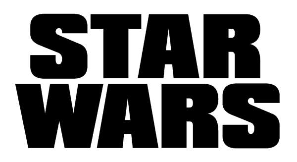
The Star Wars logo is custom lettering by Dan Perri, drawn in a vanishing point perspective and intended for the opening crawl of the 1977 film. Futura Display and Compacta Black were seemingly used in some of the other marketing for Star Wars, including some of the international logos drawn to match the style of Perri's logo. Whether or not those exact typefaces were the basis for Perri's original logo is not discernible. Below is an example of how it could have been done.
Possible Compacta Black modification demo:
Edited on Dec 07, 2021 at 07:58 by frd
Possible Compacta Black modification demo:
Edited on Dec 07, 2021 at 07:58 by frd
Nope. It's custom lettering by Dan Perri, drawn in a vanishing point perspective and intended for the opening crawl of the 1977 film. I can say that Futura Display and Compacta Black were seemingly used in some of the other marketing for Star Wars, including some of the international logos drawn to match the style of Perri's logo. Whether or not those exact typefaces were the basis for Perri's original logo is not discernible. Below is an example of how it could have been done.
Possible Compacta Black modification demo:
Edited on Dec 07, 2021 at 07:55 by frd
Possible Compacta Black modification demo:
Edited on Dec 07, 2021 at 07:55 by frd
Nope. It's custom lettering by Dan Perri, drawn in a vanishing point perspective and intended for the opening crawl of the 1977 film. I can say that Futura Display and Compacta Black were seemingly used in some of the other marketing for Star Wars, including some of the international logos drawn to match the style of Perri's logo. Whether or not those exact typefaces were the basis for Perri's original logo is not discernible. Below is an example of how it could have been done.
Possible Compacta Black modification demo:
Edited on Dec 07, 2021 at 07:53 by frd
Possible Compacta Black modification demo:
Edited on Dec 07, 2021 at 07:53 by frd
Nope. It's custom lettering by Dan Perri, drawn in a vanishing point perspective and intended for the opening crawl of the 1977 film. I can say that Futura Display and Compacta Black were seemingly used in some of the other marketing for Star Wars, including some of the international logos drawn to match the style of Perri's logo. Whether or not those exact typefaces were the basis for Perri's original logo is not discernible. Below is an example of how it could have been done.
Possible Compacta Black modification demo:
Edited on Dec 07, 2021 at 07:51 by frd
Possible Compacta Black modification demo:
Edited on Dec 07, 2021 at 07:51 by frd
Nope. It's custom lettering by Dan Perri, drawn in a vanishing point perspective and intended for the opening crawl of the 1977 film. I can say that Futura Display and Compacta Black were seemingly used in some of the other marketing for Star Wars, including some of the international logos drawn to match the style of Perri's logo. Whether or not those exact typefaces were the basis for Perri's original logo is not discernible.
Possible Compacta Black modification demo:
Edited 6 times. Last edit on Dec 07, 2021 at 13:44 by marty666
Possible Compacta Black modification demo:
Edited 6 times. Last edit on Dec 07, 2021 at 13:44 by marty666

"A New Hope" and "The Empire Strikes Back" use News Gothic Extra Condensed (1908, not currently digitized). Current digital versions of News Gothic Extra Condensed are not quite the same and much less condensed.
A digital option might be Jefferson Gothic (1916), which was Monotype's alternate version of News Gothic Extra Condensed. Just stick to Jefferson Gothic's uppercase as the lowercase consists of alternates not seen in the original News Gothic Extra Condensed.
More info here:
https://fontsinuse.com/typefaces/3645/ltc-jefferson-gothic
https://fontsinuse.com/typefaces/75748/news-gothic-extra-condensed
https://www.myfonts.com/WhatTheFont/forum/case/1181480/
Suggested font: Jefferson Gothic

See Jefferson Gothic (1916), which was Monotype's alternate version of News Gothic Extra Condensed (1908, not currently digitized).
More info here:
https://fontsinuse.com/typefaces/3645/ltc-jefferson-gothic
https://fontsinuse.com/typefaces/75748/news-gothic-extra-condensed
More info here:
https://fontsinuse.com/typefaces/3645/ltc-jefferson-gothic
https://fontsinuse.com/typefaces/75748/news-gothic-extra-condensed
Suggested font: Jefferson Gothic

It is essentially custom lettering, originally created for the 1959 book of the same name. Aside from the subtle differences, Compacta wasn't released until 1963.
A much closer possibility is Filmotype Glenlake, originally released in 1955. It's not exact but very close. Maybe something they had typeset and then modified. Of course, there were also a number of similar gaspipe lettering styles that a decent lettering artist could easily whip up too, so it's hard to say for certain.
Edited on Dec 07, 2021 at 03:12 by conman1985
A much closer possibility is Filmotype Glenlake, originally released in 1955. It's not exact but very close. Maybe something they had typeset and then modified. Of course, there were also a number of similar gaspipe lettering styles that a decent lettering artist could easily whip up too, so it's hard to say for certain.
Suggested font: Glenlake
Edited on Dec 07, 2021 at 03:12 by conman1985

BD Doomed with stencil portions filled. Used to be available as a freebie. Don't be fooled by the Typedifferent page sample, that's BD Doomed Squareup - an alternate angular version of the same type design. Just make sure both are included if you order it.
Suggested font: BD Doomed
Weiss Titling is only used in the opening title sequence of the film. The poster logo could be based on a typeface known as Argonaut - possibly the Semi-Condensed weight. Argonaut had several variants released by Headliners International. I believe the only digital version (bold weight) is known as OPTI Althea from the early 1990's Castcraft Software OPTIFont Collection. Several characters are slightly different (R, T) but others (C, S, X) are almost identical to Argonaut typeface specimens. Another possibility might be Elmont, which is also very close but further specimens would be needed to confirm that it matches. Elmont has no digital version.
More info:
https://www.myfonts.com/WhatTheFont/forum/case/997964/
https://fontsinuse.com/typefaces/73960/argonaut
http://e-daylight.jp/fonts/type/e/elmont.html
More info:
https://www.myfonts.com/WhatTheFont/forum/case/997964/
https://fontsinuse.com/typefaces/73960/argonaut
http://e-daylight.jp/fonts/type/e/elmont.html

VGC listed it as Bessellen.

Edited on Jul 20, 2021 at 14:39 by conman1985
Suggested font: Bessellen
Edited on Jul 20, 2021 at 14:39 by conman1985

Streets Of London by Lazydogs Typefoundry is another digital version.
[EDIT: Linked suggested font in first post (Nov 09, 2020 at 03:12) should read Kindersley Grand Arcade and not Streets Of London. Apologies for any confusion.]
[EDIT: Linked suggested font in first post (Nov 09, 2020 at 03:12) should read Kindersley Grand Arcade and not Streets Of London. Apologies for any confusion.]
Suggested font: Streets Of London
One is Kindersley MoT Serif, designed by David Kindersley in 1952 for the British Ministry of Transport. Kindersley Grand Arcade is a free digital version.
More info:
http://luc.devroye.org/fonts-26285.html
http://www.kindersleyworkshop.co.uk/type-design/
More info:
http://luc.devroye.org/fonts-26285.html
http://www.kindersleyworkshop.co.uk/type-design/
Suggested font: Kindersley Grand Arcade
Likely NewCompact, an early Mac Type 1 Postscript family of 4 fonts (with additional extended and oblique versions) created by David C. Saunders in April, 1989. A TrueType (TTF) version from 1992 is still floating around the web - most likely a slightly altered clone as it includes an Altsys Metamorphosis tag and no author credit to David C. Saunders. The E, F, and L, as well as some numbers, are (ever so) slightly different in the TrueType version. This is most likely the result of one of the following scenarios: 1) The original Mac version of NewCompact had these alternate characters available as extra glyphs but these were lost or altered when it was converted to TTF (a common practice in 90s and 00s font cloning was to copy a font but alter glyphs so as to circumvent legal ramifications), or 2) It was altered by a graphic designer for Spice Girls marketing and merchandise (probably to make the SPICE logotype more balanced).
See above post for Mustang Sans, a Spice Girls accurate recreation which features the wider E, F and L as well as more accurate numbers and punctuation.
See above post for Mustang Sans, a Spice Girls accurate recreation which features the wider E, F and L as well as more accurate numbers and punctuation.

Telford Italic from Telford family (4 fonts including Regular, Italic, Hollow, Hollow Italic) created by Roger White in 1993.
Edited on Jul 27, 2020 at 16:03 by frd
Suggested font: Telford
Edited on Jul 27, 2020 at 16:03 by frd
All times are CEST. The time is now 07:52
