
Forum
1,699 identified fonts All posts Requests only
Identified fonts by sjh


Identified font: Invasion 2028


Going out on a limb here: I think its Typo Round Regular, but the es were rotated to straighten out the crossbar. Thats my story, and Im stickin to it.
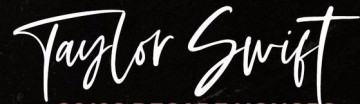
Identified font: Typo Round

The sample uses many of the alternate glyphs in the typeface. Check out the samples at the website.
Identified font: Bigskate


Identified font: Rib One

Identified font: Brisk Inline Grunge


Identified font: Forte

Identified font: Tuesday Vibes


Identified font: Estelle

Identified font: 28 Days Later
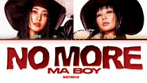
The NO MORE looks like Syntax Error, but with the characters horizontially stretched (the N and second O are cut off, of course).
Stuck on MA BOY, so hope theres other help for you.
Edited on Jan 19, 2024 at 06:14 by sjh
Stuck on MA BOY, so hope theres other help for you.
Identified font: Syntax Error
Edited on Jan 19, 2024 at 06:14 by sjh

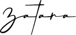
To get your result, you can set "Za ta ra" and then move things around. Otherwise, you get ligatures with different looking glyphs. Or, maybe there are stylistic alternates.
Identified font: Siestha

Bebas Neue is not a good match (diferent R; the cuts on the ends of the S), and the Bebas at Dafont has a broken # sign, or so it looks.
Identified font: Bebas
All times are CEST. The time is now 23:19
