
Forum
1.703 identifizierter fonts Alle Beiträge Nur Anfragen
Identifizierte Fonts von sjh

Identifizierter Font: Blacksword

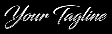
Identifizierter Font: Fancy Heart BK
The r in the sample is a stylistic alternate in the typeface. Look at the 9th of the sample cards: Mister Drake shows it.
Identifizierter Font: Autogate Rough

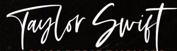
Identifizierter Font: Velocette

Identifizierter Font: Invasion 2028


Going out on a limb here: I think its Typo Round Regular, but the es were rotated to straighten out the crossbar. Thats my story, and Im stickin to it.
Identifizierter Font: Typo Round

The sample uses many of the alternate glyphs in the typeface. Check out the samples at the website.
Identifizierter Font: Bigskate


Identifizierter Font: Rib One

Identifizierter Font: Brisk Inline Grunge


Identifizierter Font: Forte

Identifizierter Font: Tuesday Vibes


Identifizierter Font: Estelle

Identifizierter Font: 28 Days Later
Alle Zeitangaben sind CEST. Es ist jetzt 23:51
