
Forum
5,872 identified fonts All posts
Identified fonts by koeiekat


What you show is the Lalique Condensed, one of SWFTE's variations on the Arnold Boecklin.
Edited on Oct 14, 2013 at 14:38 by drf
Identified font: Lalique Condensed
Edited on Oct 14, 2013 at 14:38 by drf

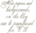

Identified font: Satisfy

Identified font: Burgues Script

Identified font: Janda Cheerful Script
There are others like the Warp 1 and the fStop (here on dafont) but notice the hanging |r|.
Identified font: Filthy Habits

Identified font: Dalliance Roman
Identified font: ITC Conduit

If you think the Comfortaa is very similar to the Comic Sans you desperately need new glasses.
Identified font: Comfortaa

Identified font: La Danse


Identified font: Legend M54
Identified font: Wisdom Script

Identified font: GoudyMedieval

Identified font: Mensch Bold Inline
Identified font: Europe Underground Light

Identified font: Windsong
All times are CEST. The time is now 18:01
