
Foro
5.872 fuente identificadas Todos los posts
Fuentes identificadas por koeiekat


What you show is the Lalique Condensed, one of SWFTE's variations on the Arnold Boecklin.
Editado el 14/10/2013 a las 14:38 por drf
Fuente identificada: Lalique Condensed
Editado el 14/10/2013 a las 14:38 por drf


Fuente identificada: Satisfy

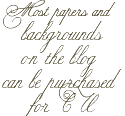
Fuente identificada: Burgues Script

Fuente identificada: Janda Cheerful Script
There are others like the Warp 1 and the fStop (here on dafont) but notice the hanging |r|.
Fuente identificada: Filthy Habits

Fuente identificada: Dalliance Roman
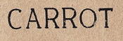
Fuente identificada: ITC Conduit

If you think the Comfortaa is very similar to the Comic Sans you desperately need new glasses.
Fuente identificada: Comfortaa

Fuente identificada: La Danse


Fuente identificada: Legend M54
Fuente identificada: Wisdom Script

Fuente identificada: GoudyMedieval

Fuente identificada: Mensch Bold Inline
Fuente identificada: Europe Underground Light

Fuente identificada: Windsong
Huso horario CEST. Ahora son las 10:05
