
Forum
854 posts Caratteri Identificati Solo richieste
Posts di metaphasebrothel

Anything which resembled that on dafont would be in the Gothic -> Medieval section:
https://www.dafont.com/theme.php?cat=401
Re: Manfred Klein: Most likely he is now deceased. His last post of the Internet was in 2008.
Re: Dieter Steffman: If Dieter is still alive, I believe he had a policy of granting permission to use his fonts commercially with no fee to anyone who asked him politely on his home page.
@toto@k22: In my case, Rodolphe asked me if I wanted to be a forum moderator one or two days after I said to a member named 'Jason' "You are what you eat, and you're a dick".
Badlock first appeared on myfonts on September 27, 2005. Bedrock was added to legionfonts on March 14, 2017.
Without looking at both fonts with ScanFont3, I can't tell how similar they are in terms of vector construction.
Badloc does not appear, at least, not under that name, in my print edition of The Electronic Type Catalog by Steve Byers, copyright 1991; I have the February, 1992 edition; ISBN 0-553-35446-9 - Bantam Books.
I've said in this forum previously that everything I know about the technical aspects of making fonts was learned from toto@k22, other that what I learned through trial and error.
This is Luc Devroye's page about Grant Hutchinson, who designed Badloc: https://luc.devroye.org/fonts-37864.html
Luc knows more about typography than toto@k22, but I didn't receive technical knowledge about making fonts from him.
Luc's site will probably remain on the Internet as long as electricity exists. As a current or emeritus professor at McGill University, the school might well cover the bandwidth cost, which are minimal - there isn't a lot that can be downloaded directly from his site, other than from the font hosting section.
I sent an e-mail to Luc a few days ago, and I have not received a reply. In the past, he's ALWAYS replied within 24 hours, and we have exchanged many e-mails since 2008. Luc hosts my homepage, and I was the first font author included in his font hosting section. This is because no other sites wanted to post my early fonts from 2007/ 2008, not because they were bad, but because they had unusually large file sizes. Rodolphe told me that he liked the Gypsy Tarot fonts, but he couldn't use them on dafont because 'they caused the blue screen of death when opened in preview with Windows Vista if cleartype was enabled'.
If I don't get an e-mail response from Luc in the next couple of days, I'll try to reach him by telephone.
Fanil Nayab, the moderator whom I know is deceased if koeiekat. His last forum post was in November, 2016.
The guy was very knowledgeable about fonts, and also very rude in many of his replies.
If you want to see what he contributed to the dafont forum, click this link: https://www.dafont.com/forum/user.php?user=209595.
You can find all of the forum posts for anyone with a dafont account who has made at least one post in any forum by clicking on their dafont nickname link anywhere that you see it on the site. That will bring you to their profile page, where you'll see if they've submitted any fonts, whether they've identified any fonts, and whether they've posted in the forums. If will also tell you whether or not they are a forum moderator.
koeiekat would have added his two cents worth to every one of the old 'discussion' threads you were asking about.
There is also a link to each of the forum threads in which he posted. If the topic title interests you, there's no reason why you can't revive a few threads which haven't had a new post in years. That's called 'necro bumping ' on many message boards, and it's done frequently. It's actually a good idea to have all posts about a specific topic in one thread. Instead we have 713 separate threads of 'Why hasn't my font been posted yet?'.
Perhaps that might prompt others to chime in with their own opinions. Someone might be more likely to open and add to a thread which already has a lot of replies, rather than a new one with none.
More about forum moderators
The moderators who are not also employees of dafont are not paid anything. Either Rodolphe of one of his staff sent them a private message at some point asking if they would like to be a moderator, and they accepted. No one applies for the position, they are chosen.
Many of the dafont members who identify a lot of fonts in the Font Identification forum are moderators. This allows them to confirm when fonts have been correctly identified. For at least one person here, font identification is a competitive game, and the statistical leader board matters to them.
Moderators can also hide forum posts which are clearly spam posted by a bot, or if the content of a post is inappropriate for this site. dafont is less strict than many message boards in that regard.
Moderators can also ban a member from the forums for either a specific number of days, or permanently. Whenever a member is banned, a staff member/ moderator will review the situation, and sometimes overturn the decision.
I was invited to be a moderator by Rodolphe, mostly because I sometimes write very long forum posts, explaining things in detail. It's certainly not for my font identification skills; I might be in the top 500 all time with 25 IDs, but the leader board only shows the top 100.
Perhaps you should initiate some discussion threads.
The dafont forums are not a chat room. They're use mostly for members asking questions related to typography, and most of the replies are from staff and/ or forum moderators.
I count 57 people who have moderator status, including myself. I know that at least one of them is deceased. I know of at least one more who hasn't posted anything in the forums in 12+ years. Apparently there is one moderator who's had the position for 20+ years who visits once every few years, just to identify a few fonts.
This is not a place to discuss sports, politics, movies or any topic which doesn't relate to typography There are plenty of other places which welcome those sorts of discussion topics.
The vast majority of forum resources are dedicated to Font Identification.
Send a private message to frd or marty666 they are both forum moderators and dafont staff members. include the site link to the font in question, and your concerns.
Keep in mind that glyphs in fonts are essentially 'ink blots' in an organized pattern. That's very different from a digital photograph or video. There are no laws governing lewd-looking silhouettes. Perhaps your imagination is the issue, rather than the font glyph you described.
If staff have deemed a font to be inappropriate for a younger audience, there will be a warning posted. Here's an example:
https://www.dafont.com/vintage-porn.font
There are three fonts with this warning in the Dingbats -> Sexy section.
@arcanefonts: I see the word 'demo' in your post of March 28. If you submitted a alphabet font without, at minimum, 26 letter glyphs, (ie: if there was no k and w for example), it won't be hosted by dafont.
The minimum number of glyphs is less for a dingbat font; possibly 13, and that's only if they are really good dings.
Part of the reason for delay:
dafont is the premiere site for free-to-download fonts. There are hundreds of sites from which people can freely download fonts, but only a handful to which someone can upload new creations. All of those other sites download fonts from dafont, and host them without requesting permission from the font authors.
I haven't visited fontspace(dot)com in a long time, but if they haven't changed there submission policy, fonts are posted a few minutes after they're submitted, because there is, or was, no evaluation process. Anyone who has signed up for a free account there can submit a font and have it posted, even if they did not create the font themself. This is good for people who have old freeware and shareware fonts from the 1990's and early 2000's in their personal collections which they aquired from sites which no longer exist. It's bad for people who are scrolling through the new postings, because a lot of the fonts are really bad - they would be rejected, if they were submitted to dafont, because they don't meet the minimum standards for THIS site.
I've made a number of fonts which have only one glyph. Some of those I posted on fontspace, some I submitted only to my homepage on Luc Devroye's site, and some I only share on private forums. dafont would not host these, regardless of quality, because they don't contain the minimum number of glyphs.
Rodolphe rejected a few of my early fonts from 2007 and 2008. He told me via e-mail that he liked them, but they were too complex to be viewed in preview using Windows Vista, if cleartype was enabled - they caused 'the blue screen of death' when opened in preview, even though they worked properly if they were installed and typed in a document. In a few cases, Rodolphe was able to post my early complex fonts my moving the glyphs from the lower case range to upper case, which limited the number of glyphs appearing in preview.
There are some people who submit fonts to dafont which are not their own original work - they might have, for example, a commercial font, and they change the internal file names, and attempt to pass the renamed font off as their own work. dafont's reputation would suffer if any such submission was hosted here. There are also some font authors who don't understand all of the necessary steps required to make a font properly. The spacing between letters, ('kerning') might be too large or too small, or the ascenders and descenders, (ie: the portion of a glyph above the height of the flat topped glyphs or below the baseline), might not be properly set, resulting in glyphs which have part of the vector cut off, when typed. In other cases, the font author places glyphs in the wrong locations, perhaps unknowingly.
All of these things have to be checked before a submitted font can be approved. Regular contributors who have previously had there submissions posted might be fast tracked, because they have already demonstrated that they know how to make fonts properly. I think the delay applies mainly to new authors, who have not yet proven their competence.
I need avamaxxxx to stop shouting.
Near the top of each page which displays fonts with a text sample, the preview field is directly above. Further to the right is the Submit button. Directly to the right is a heading 'more options', with a downward pointing arrow.
Click the arrow. You will have the option of displaying only the fonts which have accented glyphs by checking a box.
Keep in mind that all fonts hosted by dafont are free to download. When English is the first language of font authors, they are less inclined to include accented characters. Many of the fonts with extensive character maps are commercial; you would need to purchase these to own a copies.
In some cases, the font author will post a basic version of the font with a minimal number of glyphs, and a full version with extended character map is available somewhere else, but with an acquisition fee.
Modificato 3 volte. Ultima modifica su 23/08/2025 alle 00:57 da metaphasebrothel
@TatooWoo:
If you want to post links in the dafont forum, manually type the html tags before and after the url of your page or image link.
For a page link, type left bracket, ([), type url, then type right bracket, (]). Copy the url for the page you want to link, then repeat the html tag with a forward slash, (/), before url.
To post an image, use the same procedure, but type img instead of url. You can also format text as bold, italic or underlined by replacing url or img with B, I or U.
The overly simplified instructions are for the benefit of other people reading this post.
Modificato su 24/04/2025 alle 00:07 da metaphasebrothel
imporcastel logo:

If you like this sort of distorted typeface, take a look through junkohanhero's font collection:
https://www.dafont.com/junkohanhero.d1293
Modificato su 16/03/2025 alle 12:08 da metaphasebrothel
https://www.dafont.com/junkohanhero.d1293
Modificato su 16/03/2025 alle 12:08 da metaphasebrothel
A shot in the dark...try using JEVS as the password, and see if you can open the .rar or .zip.
Browse the Hebrew fonts section on LucDevroye's site:
https://luc.devroye.org/hebrew-index.html
Some of them are freeware.
Modificato su 23/10/2024 alle 09:37 da marty666
https://luc.devroye.org/hebrew-index.html
Some of them are freeware.
Modificato su 23/10/2024 alle 09:37 da marty666
Turkish Alphabet:
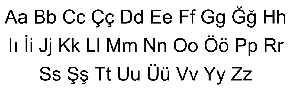
With Windows, the easiest solution, (if you're not primarily concerned with displaying the accented letters in a specific style) is this:
1) Open the Character Map and Notepad applications, (charmap.exe and notepad.exe). Both are in the System32 subfolder of your Windows folder.
2) Open charmap, and select a font with a large character set. Arial and Tahoma would be two choices you definitely currently have already installed.
3) Find the accented letters that you want to use, and double-click each, to add them to the Character Map clipboard.
4) Select accented letters from the clipboard, copy them, and paste them to the notepad text document.
5) Save the notepad text document as Turkish alphabet.
Whenever you want to use a Turkish accented letter, copy it from the document created in 5), and paste it somewhere else.
If you want to know if a different font has those same accented characters, select that other font in the Turkish alphabet text document. If the other font doesn't have those glyphs, you'll see either a blank space or a rectangular shape.
I have a text doc with the entire character map for Tahoma, (Tahoma is the font used by Windows for the display of file names, and it's impossible to uninstall it). This is the procedure I use, because I never learned how to create Unicode glyphs on my keyboard.
Modificato su 27/06/2024 alle 16:23 da marty666
Fontspace also doesn't have any verification process for new submissions. Any valid .ttf or .otf file uploaded will be posted within a couple of minutes. This is good for the impatient designers who want their submissions to be downloadable immediately. It's also great for the six year olds who make a font in five minutes, and set the license as 'free for personal use'. It's not great for users who download unusable fonts that have technical errors, (no kerning, ascender/ descender errors, incorrect side bearings, etc.).
Gyom Seguin hasn't submitted a new font here in fifteen years. It's very likely that he's no longer active in typography.
He does have a 'Donate to Author' button. Most likely this is associated with an e-mail address for a PayPal account. That e-mail address might be different from the one in his contact information.
When I released my Cabbagetown font, I pre-designated it for the public domain after December 31, 2026. That way, it will never be owned by Google, and I won't need to reply to commercial use inquiries when I no longer care about making little sums of money from licensing.
You don't have a font. You have pictures of letters.
You'd need a font editing program which allows for images to be imported, (you might first have to save your .pngs as monochrome bitmaps, .tiff, or another image type which your font editor accepts. next, you'd need to modify the vector images so they would look decent at sizes larger and smaller than the original graphics.
If you don't know how to do that, you need to learn first. What you have now is less than 1% of the finished product.
Did you try sending a private message to 'Gyom Seguin' on dafont?
https://www.dafont.com/pm/post.php?user=11892
https://www.dafont.com/pm/post.php?user=11892
Fuso orario: CEST. Ora sono le 04:53
