
Forum
1,317 posts Identified fonts Requests only
Posts by elzadra


"eneral" is in Planet Kosmos. The G is from something else. The rest is probably Arial Bold Italic.
Identified font: Planet Kosmos

Thank you so much! I didn't look in Gothic/Modern!
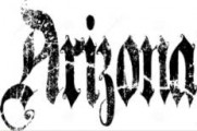
Identified font: A Gothique Time
Looks like a vintage title card but the date is 2022. It isn't in dafont's gothic/medieval category.
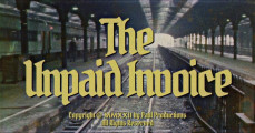

Identified font: Baron Neue

Identified font: Monotype Script MT
Identified font: Handel Gothic


Wow. I guess I'm not used to seeing the lighter weight in upper and lower case. Thank you.
Based on? It's simiar but the W is different.

Suggested font: Company

Identified font: Planet Kosmos
I should know this one. Argh.

Identified font: Perpetua
Thank you, jerseygirl!
Edited 3 times. Last edit on Oct 03, 2022 at 00:49 by elzadra
Edited 3 times. Last edit on Oct 03, 2022 at 00:49 by elzadra
I know this is marginal, but someone keeps asking about this elsewhere and I want to put it to bed. Thanks.

Thank you!
All times are CEST. The time is now 08:43
