
Forum
986 posts Identified fonts
Posts by toto@k22

Look around Dafont. If you find a font that you interested to use for commercial purposes, go talk with the font author about licensing conditions and fully disclose how you are going to use the font. If you need paperwork, tell the author about it.
Upload your font (OTF or TTF) to a file host and post the link here
Do you have an account to a file host? If yes, upload it there.
If you do not have one, try https://workupload.com/
Do you have an account to a file host? If yes, upload it there.
If you do not have one, try https://workupload.com/
Sorry I misinterpreted your message. I believe PayPal is the only option here and PayPal will reject payments received by PayPal accounts created in Sri Lanka.
If you have a relative or good friend outside of your country who can create a PayPal account for you, I think that is an option that you should consider to receive payments/donations at PayPal. Then wait for PayPal to come to terms with your government and resolve their issues before you can withdraw your money. Or if you travel to another country, like India or Maldives, you can create a PayPal account from there to receive donations and other payments. You still cannot withdraw money to your bank account in Sri Lanka but PayPal will no longer reject payments/donations to you. And do not access that account from Sri Lanka while PayPal still has issues with your government. Anyway PayPal will still send you notices of donations/payments received via email.
If you have an account in another payment system that allows payments to your country, you can place a text file in the ZIP containing your font that you are requesting donations should be sent to your account in that payment system. Also add that information to your font's description page. When that is in place, disable Dafont's donation link.
As far as I know PayPal allows anyone from Sri Lanka to send payments/donations. What you can not do is receive payment at PayPal.
With regards to alternatives, you'll have to ask the font author about that.
With regards to alternatives, you'll have to ask the font author about that.
why not install the font in another computer with Word and see what happens.
Get in touch with the font author and ask him/her what are the terms and conditions for commercial use. Also tell the author exactly how the font is going to be used.
The font author sometimes places a file in the downloaded zip archive with his/her contact information. You can also send the author a private message here in Dafont.
The font author sometimes places a file in the downloaded zip archive with his/her contact information. You can also send the author a private message here in Dafont.
Are you willing to show your font? Hard to say anything without seeing the font.
Check your font's encoding.
Check your font's encoding.
For some font authors, a donation is enough for you to use the font for commercial purposes. For others, a donation is just a donation and does not give you the right to use the font for commercial purposes.
It is better to ask the font author directly if you intend to use a font for commercial purposes. Most font authors here can be reached through private messaging.
It is better to ask the font author directly if you intend to use a font for commercial purposes. Most font authors here can be reached through private messaging.
IMO your use of the font is no longer personal use. However, the authors of those fonts might have a different interpretation of the meaning of personal use. All authors of the fonts you enumerated can be reached through private messaging here at Dafont so I suggest that you ask them directly.
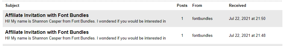
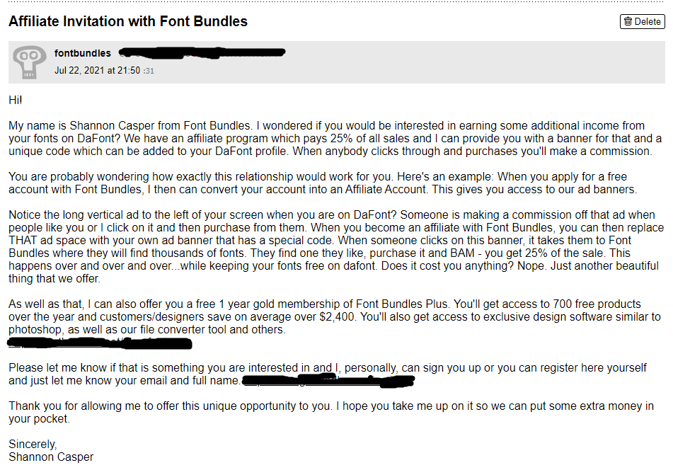
I receive the same message, actually 2 private messages, from them but mine have extras. The way I understand it is that if someone clicks on your affiliate link, you will get 25% commission from whatever that person spends at their site.
.
.
You should ask the font author directly as font authors have different interpretations of the term For personal use only.
If that is my font, your use of the font is no longer personal. Others are fine with that. If the font comes with documentation, read it.
If that is my font, your use of the font is no longer personal. Others are fine with that. If the font comes with documentation, read it.
It is a custom font for Nike. There is no legitimate distributor of that font.
You can get that font only from Nike and the national football federations of Croatia and Malaysia, and other countries that may be using it also.
You can get that font only from Nike and the national football federations of Croatia and Malaysia, and other countries that may be using it also.
if Dafont's preview has a line before the first letter and/or a line after the last letter, the font you download will have that feature.
This might not be the font you have in mind but this thread explains how to access those letters with lines
https://www.dafont.com/forum/read/429491/adding-the-extra-bits-at-the-ends-of-letters
This might not be the font you have in mind but this thread explains how to access those letters with lines
https://www.dafont.com/forum/read/429491/adding-the-extra-bits-at-the-ends-of-letters
Hashirama_17 said 
is it allowed for commercial purposes of fonts that categorized as 100% free or public domain / GPL/ OFL?
Public domain - Yes, without restriction.
GPL/OFL - Yes but read the terms and conditions of the license
100% free - Supposed to be yes. If there's a way for you to reach out to the font author, ask the font author directly.

Bridge Type is a custom font designed for the UEFA Euro 2020 competition. See https://www.adotbelow.com/ for info
There is no legit download for this font.
There is no legit download for this font.
Identified font: Bridge Type
Are you referring to this?
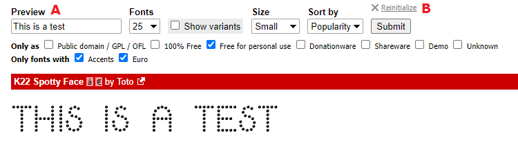
If that's it and you only wanted to revert to the default preview string, delete the text that you entered in the preview text box (A) and click on the Submit button. However, if you made other customization to the font preview and wanted to revert everything to the default, click on the Reinitialize (B) link found right above the Submit button.
If that's it and you only wanted to revert to the default preview string, delete the text that you entered in the preview text box (A) and click on the Submit button. However, if you made other customization to the font preview and wanted to revert everything to the default, click on the Reinitialize (B) link found right above the Submit button.

That is the Adidas font used during the 2014 World Cup. See https://www.dafont.com/forum/read/137673/adidas-2014-world-cup-type
Identified font: Adidas 2014
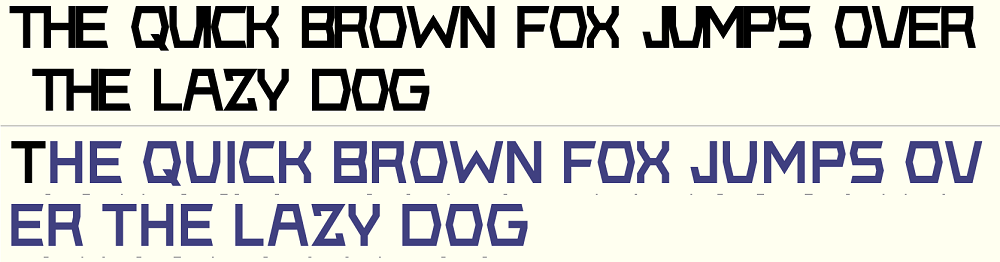
I had a look at your font and it is very dependent on kerning. It should not be that way. Here's your font with kerning turned off (top) and with kerning (bottom)
Adjust the spaces to the left and right of a letter/symbol as best as you could. Then use kerning to fine tune the spacing between letters.
Adjust the spaces to the left and right of a letter/symbol as best as you could. Then use kerning to fine tune the spacing between letters.
It is very likely that those sites do not support kerning and it looks like you rely too much on kerning.
I have not seen your font so this is just an opinion based on what I see on your images. I assume that image 3 and 4 are showings from different sites. It shows that your font is either too tightly spaced or those sites mangled the font's kerning but I still say it is tightly spaced. You should try to space your letters similar to what is shown in image 1 and 2. Kerning should never be used as the primary method of spacing the letters. What you should do is redo your letter spacing or horizontal metrics. First delete all of the font's kerning and then adjust the spacing the best you could. When you get an almost perfect spacing you will still see some letter pairs that require further adjustments. That's the time to start kerning your font. When you've done the best you could, grab some paragraphs of text from the web and use your font on it. Do you see some letter pairs that look too loose or too tight, kern those pairs. I will guarantee you that your font will look a lot better on sites that do not support kerning for their previews.
But before doing all of these, keep a backup copy of your original FontForge file just in case you do not like the result of the modification.
BTW I do not know how to use FontForge so I cannot answer any question specific to FontForge but there are many here who are extremely good at FontForge
You want to change sanjar-kasmamytov to sanjardev? I do not know if that is possible but only site admins can make a definite statement about that.
All times are CEST. The time is now 13:58
