
Forum
3,821 posts Identified fonts
Posts by donshottype


Compare to Bordeaux Roman with width compressed to 75%

Close, but not identical.
Close, but not identical.
Suggested font: Bordeaux Roman

These are high contrast sans-serif letters with ball terminals tacked on to the _f_ and _r_, and demi-serifs -- a fad in the 1980s -- pasted on _P_ and _r_.
The Pfizer logo was designed in 1987 by Gene Grossman at Anspach Grossman Portugal.
For a somewhat similar high contrast sans-serif -- without ball terminals or demi-serifs -- Imperial Ultra Bold Oblique is in the ball park. For a closer match to the _e_, imagine the _o_ with a cross bar and a gap below it.
Suggested font: Imperial UltraBold Oblique

Futura Medium made heavier, with _S_ from another source.
Do not use the ready-made heavier weights. They clip the pointed tips on _M_ and _A_
Do not use the ready-made heavier weights. They clip the pointed tips on _M_ and _A_
Identified font: Futura Medium

Very few fonts in this style.
See:
https://fontsinuse.com/typefaces/40188/pampam
https://fontsinuse.com/typefaces/4814/coquette
https://fontsinuse.com/sets/1727/gandour
https://fontsinuse.com/typefaces/40230/enfantine
Enfantine is the only one of these available as a retail font.
Expensive.
AFAIK, no free font is even in the ballpark.
Suggested font: Enfantine

Wordmark dating back at least as far as 1988
https://trademarks.justia.com/773/84/markwell-77384625.html
Squarish letters sloped into a script with the feeling of some late 1950s vehicles, appliances and technical products.
A MyFonts search for emblem produces some fonts with similar features, including Linotype Automatic, Staromat, and Fuel Script.
None are close enough to suggest as a substitute.
For something similar, but without the script effect, you could slope Futura Display
http://myfonts.us/td-YR1rcU
Possibly the source of inspiration for the wordmark. Compare the _a_, _k_, _w_, _e_and _M_.
Edited 3 times. Last edit on Apr 10, 2017 at 15:15 by frd
https://trademarks.justia.com/773/84/markwell-77384625.html
Squarish letters sloped into a script with the feeling of some late 1950s vehicles, appliances and technical products.
A MyFonts search for emblem produces some fonts with similar features, including Linotype Automatic, Staromat, and Fuel Script.
None are close enough to suggest as a substitute.
For something similar, but without the script effect, you could slope Futura Display
http://myfonts.us/td-YR1rcU
Possibly the source of inspiration for the wordmark. Compare the _a_, _k_, _w_, _e_and _M_.
Suggested font: Futura Display
Edited 3 times. Last edit on Apr 10, 2017 at 15:15 by frd
Examine the following image of the script -- scanned from a box containing six large bottles:

A test for checking whether this could be a font is to determine if the leading connectors of _r_ and _s_ are the same at the tip where the trailing connectors of various letters should line up smoothly with them. Some fonts use ligatures for unusual connections, such as _st_, so this combination can be ignored. Perhaps also the _on_ combination -- another ligature? Some fonts use different trailing connectors for the final letter of a word, so the final _e_, _d_ and _n_ can also be ignored. Looking at the rest of the letters, do they line up?
Edited on Apr 10, 2017 at 14:42 by donshottype


Squeezed in width.
Original name was Profil, a shadowed outline Clarendon from the Photo-Lettering era designed by Eugen and Max Lenz for Edouard Hoffmann (founder of Haas Typefoundry in the 1950s) 1n 1946.
No digital under the name Profil because a font of another design by Linotype is currently assigned the name Profile
Digitized by Bitstream as Decorated 035
More info:
https://fontsinuse.com/typefaces/7262/profil
Identified font: Decorated 035

Don't know if the producers of the wrestler's video made or used a font to create the letters -- a check did not uncover any matching fonts -- but the style of the lower case is called Rotunda, Rundgotish or Italian Gothic.
All of the lower case letters, except for _a_, look like they were lifted from San Marco and subjected to minor modifications.
The uppercase is in a simplified fraktur style.
All of the lower case letters, except for _a_, look like they were lifted from San Marco and subjected to minor modifications.
The uppercase is in a simplified fraktur style.
Suggested font: San Marco
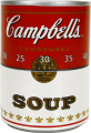
Campbell's is hand lettering from circa 1900.
AFAIK it has not been the source of a font which is an exact match.
Cafe Aroma is similar. For the _e_ try flipping and mirroring the _3_. Not quite right so you might try this trick with another baseball or packaging script.
According to a New York times article
"The Campbell script ... is very similar to Joseph Campbells own signature, which may have been used as a basis for the label script... [The script] was designed to appeal to the housewife of the time ... [and] was intended to look like cursive handwriting ... that one would find on handwritten recipes, equating to Homemade.
http://6thfloor.blogs.nytimes.com/2011/05/09/who-made-that-campbells-soup-label/
Edited on Apr 07, 2017 at 14:07 by donshottype
AFAIK it has not been the source of a font which is an exact match.
Cafe Aroma is similar. For the _e_ try flipping and mirroring the _3_. Not quite right so you might try this trick with another baseball or packaging script.
According to a New York times article
"The Campbell script ... is very similar to Joseph Campbells own signature, which may have been used as a basis for the label script... [The script] was designed to appeal to the housewife of the time ... [and] was intended to look like cursive handwriting ... that one would find on handwritten recipes, equating to Homemade.
http://6thfloor.blogs.nytimes.com/2011/05/09/who-made-that-campbells-soup-label/
Suggested font: Cafe Aroma
Edited on Apr 07, 2017 at 14:07 by donshottype

Same general design, also including a similar tail on _a_.
Several choices.
Several choices.
Suggested font: Mr Palkerson
Perhaps no exact digital match.
Newspaper headlines of the era were still often done with wooden type.
These sometimes had more fluid shapes than the metal gothic and grotesque types used for newspaper headings, which are smaller.
Some similarity of the lower case to Alternate Gothic No. One, designed by Morris Fuller Benton in 1903 and used for many years in newspaper headings.
Suggested font: Alternate Gothic No One
Deleted.
My suggestion was not helpful to anyone who is not a font maker.
Edited on Apr 06, 2017 at 16:42 by donshottype
My suggestion was not helpful to anyone who is not a font maker.
Edited on Apr 06, 2017 at 16:42 by donshottype
IMHO these are custom letters or a private font for the magazine.
Draftman's box sloped letters with added base bars that connect to the left or right of the letter, depending on the letter and its place in the word.
Draftman's box sloped letters with added base bars that connect to the left or right of the letter, depending on the letter and its place in the word.
Handlettered version of a font Origially released as Pretorian by P.M. Shanks & Sons Ltd., The Patent Type Foundry, London circa 1900. [Name asBoer War commemoration]
Available free here at Dafont as Storybook
Also available as Pretoria by Ascender Corp., Pretorian DT, by DTP Types, Pretoria Gross by Paulo W of Intellecta Design, Gans Rasgos Escritura by Iza W of Intellecta Design P820-Deco by SoftMaker Software GmbH, Vostrey by Weatherly Systems Inc, and others. Some have bonus swash tails, bonus fancy frames, hand tooled effects etc.
Edited on Apr 05, 2017 at 20:42 by donshottype
Available free here at Dafont as Storybook
Also available as Pretoria by Ascender Corp., Pretorian DT, by DTP Types, Pretoria Gross by Paulo W of Intellecta Design, Gans Rasgos Escritura by Iza W of Intellecta Design P820-Deco by SoftMaker Software GmbH, Vostrey by Weatherly Systems Inc, and others. Some have bonus swash tails, bonus fancy frames, hand tooled effects etc.
Suggested font: Storybook
Edited on Apr 05, 2017 at 20:42 by donshottype

There is also a version called Ruben, which looks like a match to _1 DOWN MC ORANGE_

Unfortunately, no legitimate download
Edited 3 times. Last edit on Apr 05, 2017 at 15:09 by donshottype
Unfortunately, no legitimate download
Identified font: Ruben
Edited 3 times. Last edit on Apr 05, 2017 at 15:09 by donshottype

Probably custom, either as letters or a font for Marvel.
Derived from Agency
See Agency FB Condensed and imagine the center strokes shifted downwards.
The _A_ was available as an alternate
Edited on Apr 05, 2017 at 19:12 by donshottype
Derived from Agency
See Agency FB Condensed and imagine the center strokes shifted downwards.
The _A_ was available as an alternate
Suggested font: Agency
Edited on Apr 05, 2017 at 19:12 by donshottype
This is a version of Rubens, cut by John K. Rogers for the Boston Type Foundry in 1884
https://www.google.com/patents/USD14964
There is a digital Rubens by Wooden Type Fonts
http://myfonts.us/td-G6922M
but is narrower and has differences.
Macbeth is another digital Rubens but it is bolder than _1 DOWN MC ORANGE_
https://www.google.com/patents/USD14964
There is a digital Rubens by Wooden Type Fonts
http://myfonts.us/td-G6922M
but is narrower and has differences.
Macbeth is another digital Rubens but it is bolder than _1 DOWN MC ORANGE_
Suggested font: Macbeth
Dharma Gothic ExBold is the best match for the compound curve for the middle stroke of _a_, but its _a_ has a tail.
Edited on Apr 05, 2017 at 14:02 by donshottype
Edited on Apr 05, 2017 at 14:02 by donshottype
Bottom curve of arm on _r_ close to Helvetica Bold Cond, but top curve is not
http://www.myfonts.com/fonts/linotype/helvetica/pro-bold-condensed/glyphs.html#glyphs/531526/85
Vertical stroke too thick for the letters in _embark_
http://www.myfonts.com/fonts/linotype/helvetica/pro-bold-condensed/glyphs.html#glyphs/531526/85
Vertical stroke too thick for the letters in _embark_
All times are CEST. The time is now 13:26
