
Forum
13,580 posts Identified fonts Requests only
Posts by Heron2001

LOL - as I stated "or it's another manufacturers." Sashi, even Bitstream gives Berthold credit for designing City. In the States, a judge once ruled that if a manufacturer copies a font and changes just three characters - it's a new font. That is why in the late 60s and 70s, when we switched to cold type -- the hot metal houses waited for Helvetica - the real deal - to come -- and the cold type manufacturers were putting together their own Helveticas (i.e. Alphatype's Claro.)
Now Bitstream came along and did not want to pay royalties. So they redrew every font and gave them all new names. There is a site that has most of the Bitstream fonts labeled as to what they were suppose to be.
So, you are right that the N came from them - but the typesetter in me needs to give the credit to the actual owner of the font.
Many times, I've given the name of a font, and then learned it was not the "original." Akira loves stepping on me over at myfonts, and I cannot begin to tell you how much more I learned from him over the years (of not having a typeshop anymore...)
It was probably hand tailored Rocamaco
And Nina, you are most welcome.
And Nina, you are most welcome.

I don't know about that R - it's like a Clarendon/Bodoni kind of a thing - but if you'd like something very similar (for all the other letters) you may want to consider Schadow Black Condense
http://www.myfonts.com/fonts/bitstream/schadow/
or Schadow Antiqua - which I can't seem to find - my fonts lists it - but the font they've put for it is TSI Romic. Go figure!
Edited on Sep 03, 2012 at 09:48 by drf_
http://www.myfonts.com/fonts/bitstream/schadow/
or Schadow Antiqua - which I can't seem to find - my fonts lists it - but the font they've put for it is TSI Romic. Go figure!
Suggested font: Schadow
Edited on Sep 03, 2012 at 09:48 by drf_
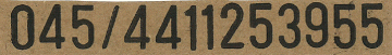
Here's another suggestion: http://www.fontspace.com/psyops/crash-numbering
Edited on Sep 03, 2012 at 09:47 by drf_
Suggested font: Crash Numbering
Edited on Sep 03, 2012 at 09:47 by drf_
You are welcome.


Identified font: 911 Porscha Italic


Identified font: P22 Josephine Hopper
You are very welcome.
The E C and R do not match at all.
Agency Bold is closer (if you condense it slightly) - but the R doesn't match....
Agency Bold is closer (if you condense it slightly) - but the R doesn't match....

Identified font: Blessed Day

Using the alternatives - they have them in glyphs for the "s" and the "n"
Suggested font: Calgary Script
That isn't necessarily the complete set of glyphs... for all I know there may be a "pro" font out there... somewhere... I saw those before... honest... it doesn't answer the question... lol
Perhaps they lopped it off - or heavied the Medium... or it's another manufacturers.
You are welcome.
Eaglefont seems set up for folks on PCs... I pressed various download buttons and the only one that worked was for a frzfonts - .exe - so I'll never know... the rest tell me I'm a MAC so forget about it!
Glad to know the policy hasn't changed...
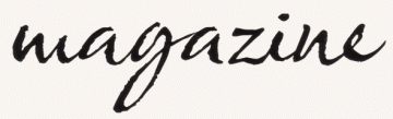
And for this sample - all the letters match Countryhouse - except for the "t" - and I was wondering if anyone here owned it and could see if it had the alternative... more than the glyphs some of the sites are showing... and since if it is an alternative and we don't know the keystroke then the "try it" from House Industries is worthless... lol
Hi y'all.
Glad to know the policy hasn't changed...
And for this sample - all the letters match Countryhouse - except for the "t" - and I was wondering if anyone here owned it and could see if it had the alternative... more than the glyphs some of the sites are showing... and since if it is an alternative and we don't know the keystroke then the "try it" from House Industries is worthless... lol
Hi y'all.
All times are CEST. The time is now 16:55
