
Forum
13,580 posts Identified fonts Requests only
Posts by Heron2001

Bravo - you do know how to tell the difference!

I can only recommend a close substitute - sorry, I don't know the original.
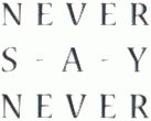
Suggested font: Magistral Medium
Et juste au cas où quelqu'un ne veut connaître le nom de l'autre police - il est Avenir.

The letters are close to Franklin Gothic - with the A modified. Just a thought...
You are welcome. Not rough - but the letter formations are pretty common - so one has to look for the uncommon letters - I personallyl love capital Rs and Qs.

Identified font: Disco Deck
Oh Fred - you saved that link - thank you. Haven't seen it in a very long time. I have my own problems telling those two apart!

malvolio - the c is different in both. The c above matches the Arial family.
Edited on Sep 09, 2012 at 20:50 by rocamaco
Identified font: Arial
Edited on Sep 09, 2012 at 20:50 by rocamaco
House Industries put out a disk years ago with House Gothic Light with Alternative Caps - I think that is what you are looking for.

Identified font: ITC Avant Garde Medium
I'm sorry malvolio - I was referring to the REBELLE part - I thought by now everyone knew that Disney's signature became a shareware font. My silly.
You are most welcome.
It could be something as simple as Helvetica Bold - http://www.myfonts.com/search/helvetica+bold/fonts/
or as complex as Chalet Book Bold - http://www.houseind.com/fonts/chaletbook
Depends if you know some more of the letters.
or as complex as Chalet Book Bold - http://www.houseind.com/fonts/chaletbook
Depends if you know some more of the letters.
YW 


Identified font: Burning Wrath
Fred, I agree with you. RoRo makes sure to keep it clean - and has proven so time and time again.
I asked Claude for his inspiration for his work - and he referred to Dan Solo's book about scripts - published in 1987.
But if you'd like we'll keep this topic closed.
I asked Claude for his inspiration for his work - and he referred to Dan Solo's book about scripts - published in 1987.
But if you'd like we'll keep this topic closed.
The M is not Avant Garde. Century Gothic is a bit closer - but not the dot on the eye.
http://www.myfonts.com/fonts/mti/century-gothic/
Edited on Sep 09, 2012 at 17:58 by Heron2001
http://www.myfonts.com/fonts/mti/century-gothic/
Edited on Sep 09, 2012 at 17:58 by Heron2001
All times are CEST. The time is now 22:13
