
Forum
986 posts Identified fonts
Posts by toto@k22

I did not answer some of your questions because those are specific to your font editor and I have no idea how your font editor works.
For #1, I don't know how is it done in FontForge. In the font editor that I am using, you just unlock the vertical metrics then open the glyph window and then drag the baseline to where you want it placed.
For #2, right click on a glyph in the font window (or open the glyph), then choose properties. Enter the glyph name and then click on the jewel on the unicode which the font editor will autofill. You can also do it the other way - enter the unicode and click on the jewel for the glyph name.
I do not use FontForge but it can do what my font editor does. Many here use FontForge and they might be able to help you when it comes to that program.
I have no idea about your font editor but you need a real font editor. Have you tried FontForge - https://fontforge.org/en-US/ - it is absolutely free and I read here Claude mentioned that it can import SVG files. It will allow you access to the settings that you wanted to change.
You only see Horiz because that section refers to the horizontal metrics of the glyph. The following are just pure guesses:
Horiz. Advance X: 1024 - could be the glyph width
Horiz. Origin X: 0 - could be the left sidebearing. Value is negative if the character extends beyond the left edge of the glyph
Horiz. Origin Y: 256 - could be the right sidebearing
The sidebearing is the space/distance from the character to the left or right edge of the glyph. Since advance was mentioned then it might be referring to the sidebearing. Does your character touch the left edge of the glyph? If it does, then Horiz. Origin X is your left sidebearing.
As for the vertical metrics, it refers to the 5 settings mentioned after Family Name in Font Face Attributes.
Units per em: 1024 - this is your font's UPM.
Ascent: 768 - the top edge of the character with the highest structure.
Descent: 256 - the bottom edge of the character with the lowest structure. This should be a negative value since it's measured from the baseline. Ascent + |Descent| = UPM
Cap Height: 717 - the top edge of the uppercase letters
x Height: 512 - the top edge of the lowercase x, might be the default of your editor.
Vertical metrics is global while horizontal metrics is glyph specific.
BTW it is OK for a TTF to have a 1000 UPM.
The page was last updated 7 years ago but you might still find answers at http://abfonts.freehostia.com/solopedia/topical.htm
amlo1108 said 
alguien sabe donde puedo conseguir la tipografía o la familia tipográfica "Bold Gradient"
This font has a style named Bold Gradient. Scroll down and see the preview of Star Fighter Bold Gradient (starfighterboldgrad.ttf)
https://www.dafont.com/star-fighter.font
The CIB Font Sans is a custom font created by Vasava for Grupo Bancolombia. For more info, see https://www.vasava.es/en/portfolio/bancolombia
You will not find a legitimate copy of this font in the wild. You will have to get it directly from Bancolombia
You will not find a legitimate copy of this font in the wild. You will have to get it directly from Bancolombia
BryndanWMeyerholt said
That depends on the license of the font. If it has a No Derivatives restriction, then editing is not allowed without permission from the font creator. (well, if it is edited, you may not distribute the modified font).
IMO if the font is not public domain or open source, do not touch it.
font01!23 said
arcing fonts or words
how do you make font or words in a arc?
how do you make font or words in a arc?
What program are you using?
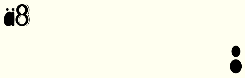
The only problem that I saw is that on the 8 and the adieresis see image below.) Both can be easily fixed but has to be done by the font author. Is there any other problem?
To post an image, place the URL of the image between [ img ] and [ /img ] Remove the space after "[" and before "]"
To post an image, place the URL of the image between [ img ] and [ /img ] Remove the space after "[" and before "]"

That's the La Liga font. If you know someone working at La Liga or the football clubs in La Liga, then you might be able to get an original copy of the font. Otherwise there are many knock-offs of the font floating out there - free or for sale.
Identified font: La Liga
See if OPTI Cooper Black Five is fine with you
http://abfonts.freehostia.com/opti/fonts-c/index.htm
Originally not free but it has been abandoned by its publisher. Opti/Castcraft seems to be out of circulation
http://abfonts.freehostia.com/opti/fonts-c/index.htm
Originally not free but it has been abandoned by its publisher. Opti/Castcraft seems to be out of circulation
What font editor are you using? Is your font editor capable of generating variable fonts? If your answer to that is no, find one that does.
BTW what kind of changes do you want to do that you need to have separate styles. The font supports VN codepage so I assume it contains a complete VN specific characters.
Edited on Jan 12, 2022 at 08:43 by toto@k22
BTW what kind of changes do you want to do that you need to have separate styles. The font supports VN codepage so I assume it contains a complete VN specific characters.
Edited on Jan 12, 2022 at 08:43 by toto@k22
Microsoft won't be happy to hear what you're planning to do with their font.
BTW you probably already have Bahnschrift installed in your Windows 10
Edited on Jan 11, 2022 at 18:31 by toto@k22
BTW you probably already have Bahnschrift installed in your Windows 10
Edited on Jan 11, 2022 at 18:31 by toto@k22
It is a variable font that is why it is a TTF.
Why do you need to have a separate font for each style when you can have all the styles in a single font?
Why do you need to have a separate font for each style when you can have all the styles in a single font?
Go to http://abfonts.freehostia.com/ click on the Extra tab, then click on the Font List on the menu, scroll down to the letter M and click on the Mexico86 link to get a digitization of a font based on that logo

Identified font: Stardust Adventure

Identified font: Friz Quadrata Bold
Yes. Class kerning used in kern OT feature. There might be problems for the accented I/i
Get a big block of text from the internet and apply your font to that. If you see letter spacing problems then kern those pairs. The assumption is that you have set your font's spacing to the best of your ability before any kerning adjustments. It does not matter what the language your sample text is in as any kerning adjustment is applicable to all the languages you mentioned, which all use Latin alphabets. The only problem I can see is with regards to the design of your accents.
What letter pairs you need to look out for depends on the style of your font. However, if you want to be anal about it, then use all possible pairs from A to Z. Here's the string for the A. Do the rest including lowercase, numbers, punctuations, etc.
AAABACADAEAFAGAHAIAJAKALAMANAOAPAQARASATAUAVAWAXAYAZA
Here's the list of pairs found in Fontlab's kerning folder. I think Fontlab uses these pairs when you choose to autokern your font.
https://workupload.com/file/hkEHrYZLdNU

You're welcome
All times are CEST. The time is now 06:02
