
Forum
77 posts Identified fonts Requests only
Posts by JapanYoshi

Looks like a version of DIN. DIN Next is just one of them, and there are many free alternatives online, like Gidole.
Suggested font: DIN Next

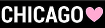
It looks like Helvetica Neue 77 Condensed and Helvetica Neue 57 Condensed.
Identified font: Helvetica Neue

DIN 1451 Mittelschrift. There are a lot of free fonts like DIN available online, like my personal favorite Gidole.
Identified font: DIN 1451 Mittelschrift

It's Gotham Bold for sure. One famous free alternative is Raleway. You might also want to check that one out because Gotham is crazy expensive.
Suggested font: Gotham
The "Alfín" looks like it's been modified, but it's most likely ITC Avant Garde Gothic, or more commonly known as just "Avant Garde".
Identified font: Avant Garde Gothic

It looks like Times New Roman Bold Italic kerned tightly.
Suggested font: Times New Roman Bold Italic

Suggested font: Keep Calm


It seems to be Tungsten Light or Tungsten Book. Fun fact: Taylor Swift's album "Red" and the video game series Just Dance (2014 and later) use some version of Tungsten.
Suggested font: Tungsten

The $ seems to be modified from the letter S instead of the bundled $, but the Japanese font HGP創英角ポップ体 (HGP Soei Kaku Pop Tai) seems to match up perfectly. Be careful though, because this font is equated in Japan with Comic Sans MS.
Edited on Oct 10, 2015 at 10:21 by JapanYoshi
Suggested font: Soei Kakupoptai
Edited on Oct 10, 2015 at 10:21 by JapanYoshi


Parece como Caslon. Muchos libros antiguos y actuales usan Caslon. Garamond es una aproximadación que parece aceptable.
Suggested font: Caslon


Suggested font: Project Paintball
All times are CEST. The time is now 08:09
