
Forum
844 posts Identified fonts Requests only
Posts by metaphasebrothel

Manfred Klein made a number of fonts with 'grid lines'. You can scroll through the one that are on dafont: http://www.dafont.com/manfred-klein.d302?page=1 or look further through his Fonteria at TypOasis: http://www.moorstation.org/typoasis/designers/klein/index.htm. The site link on his dafont page is to his last batch of fonts prior to his retirement. I don't think there are any 'grid' fonts on that page.
Manfred retired from type design in 2008, and no longer has any presence on the Internet, so there is absolutely no chance that he will personally respond to any requests. I believe that all of his fonts in circulation are free for personal use/ donationware, meaning that a donation to charity is requested, but not required, if used commercially. He designed thousands of fonts, so I can't point you toward any specific ones by name.
I think you would like something like this:

but I think those exist only as commercial vectors.
~bobistheowl
Manfred retired from type design in 2008, and no longer has any presence on the Internet, so there is absolutely no chance that he will personally respond to any requests. I believe that all of his fonts in circulation are free for personal use/ donationware, meaning that a donation to charity is requested, but not required, if used commercially. He designed thousands of fonts, so I can't point you toward any specific ones by name.
I think you would like something like this:
but I think those exist only as commercial vectors.
~bobistheowl
We're on it.
Hi, MusicGirl7, and welcome to the Dafont forums.
Here are a few of my favorites here:
Lost World: http://www.dafont.com/lost-world.font
Mysterious Voyage: http://www.dafont.com/mysterious-voyage.font
Powerview: http://www.dafont.com/powerview.font
Amazigh Motifs: http://www.dafont.com/amazigh-motifs.font
Dingleberries: http://www.dafont.com/dingleberries.font
Lost Saloon: http://www.dafont.com/lost-saloon.font
Unca Pale: http://www.dafont.com/unca-pale-1.font
VTC Nue Tattoo Script: http://www.dafont.com/vtc-nuetattoo-script.font
Jellyka Delicious Cake: http://www.dafont.com/jellyka-delicious-cake.font
BeautyMarks: http://www.dafont.com/beautymarks.font
Edited on Feb 22, 2013 at 02:42 by metaphasebrothel
Wow, I think I could see myself spending a year doing a font of one of those alphabets, but it would look awesome, even at four points. The only comment I'd get is some guy bitching because there's no Euro symbol...
Edited on Feb 22, 2013 at 02:22 by metaphasebrothel
Edited on Feb 22, 2013 at 02:22 by metaphasebrothel
claudeserieux said 
@metaphasebrothel
This is a cnc:
http://www.youtube.com/watch?v=HHq8PwqxHa4
http://www.youtube.com/watch?v=kuXAvzhZctg
This is a cnc:
http://www.youtube.com/watch?v=HHq8PwqxHa4
http://www.youtube.com/watch?v=kuXAvzhZctg
Well, excuuuuuse me, Mr Nine Million downloads. You can't blame a guy for trying to shill his 2 downloads-a-day technically precise ugly font.
How come the text display for all the Myfonts links is FineAss Girls? I'm pointing the finger at claudeserieux.
Very close to a 'single line' font:
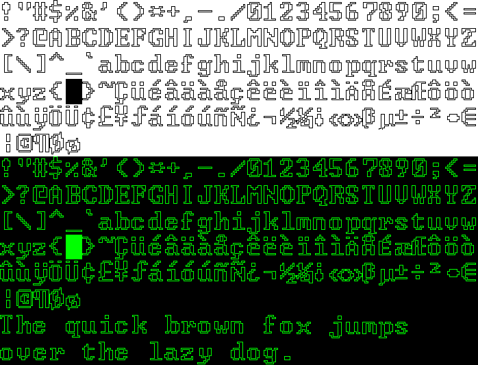
FixCystNeon at 9 points.
FixCystNeon at 9 points.
It looks like the text is in Italics, and the slant is created in a graphics program that can skew the baseline. You won't find many, (if any), fonts that slope up like that on their own. That's usually a sign of custom lettering.
1) Instructions are in the Tutorial.jpg image file, included with the font.
2) Browse the Fancy -> Old School Theme: http://www.dafont.com/theme.php?cat=104.
2) Browse the Fancy -> Old School Theme: http://www.dafont.com/theme.php?cat=104.
Download and install Winrar: http://www.rarlab.com/download.htm, and I'll bet you won't have those problems.
holly0001, the problem you are experiencing is likely related to the embedding settings in the font(s). We need to know which font(s) is/are causing the problem(s) for someone to be able to help you with a solution. Otherwise you will just get more sarcasm from the chuckleheads.
If someone downloads a free/ free for personal use/ donationware font, it means that the font is more valuable to them than the time spent to complete the download, the bandwidth needed to transfer the file, and the disk space it occupies. Many downloads are never extracted from their .zip files. Just about everybody has downloaded multiple copies of many fonts, without realizing they already have them.
If I'm walking down the street and someone offers me a free lollypop, I will accept it, but I won't make a donation to the Hare Krishnas for doing so. Just because someone downloads a font, doesn't mean they will ever actually install it, or use it if it is installed. Many people just collect fonts, like other people collect coins, or stamps, or figurines of animals.
I have declined a few requests for financial compensation for the commercial use of my free fonts. Most notably, film director Tyler Perry's representatives asked my permission to use one of my dingbat glyphs for a poster used in the background/ set dressing for a scene in his film For Colored Girls:

If a font is free, it's free for everybody, even those who can easily afford a licensing fee. Israeli Trance music DJ Liam Shachar also used a glyph from BeautyMarks in his logo:

, with my blessing. It was nice of him to e-mail a .pdf of the font in use. That's the only kind of compensation I'm looking for.
I agree with Daniel Gauthier of Gaut Fonts, who quoted Wayne Burris on his page at TypOasis: "If you want to give back to the Design community design a font.
If I'm walking down the street and someone offers me a free lollypop, I will accept it, but I won't make a donation to the Hare Krishnas for doing so. Just because someone downloads a font, doesn't mean they will ever actually install it, or use it if it is installed. Many people just collect fonts, like other people collect coins, or stamps, or figurines of animals.
I have declined a few requests for financial compensation for the commercial use of my free fonts. Most notably, film director Tyler Perry's representatives asked my permission to use one of my dingbat glyphs for a poster used in the background/ set dressing for a scene in his film For Colored Girls:
If a font is free, it's free for everybody, even those who can easily afford a licensing fee. Israeli Trance music DJ Liam Shachar also used a glyph from BeautyMarks in his logo:
, with my blessing. It was nice of him to e-mail a .pdf of the font in use. That's the only kind of compensation I'm looking for.
I agree with Daniel Gauthier of Gaut Fonts, who quoted Wayne Burris on his page at TypOasis: "If you want to give back to the Design community design a font.
johninlongmont said
koeiekat said
Because you do not play by the rules. Ever gave it any consideration why copy is spelled differently from install?
So you know better. You don't give about how things should be done. You know better. You do things your way. According to you 1 + 1 = 9703526823097. Well if you want that, OK. But don't expect things to work.
So go to the nearby supermarket, buy some ears, plug'm in and start listening.
Very dangerous though. Y might learn something. And you wouldn't want that to happen, would you?
So you know better. You don't give
 about how things should be done. You know better. You do things your way. According to you 1 + 1 = 9703526823097. Well if you want that, OK. But don't expect things to work.
So go to the nearby supermarket, buy some ears, plug'm in and start listening.
Very dangerous though. Y might learn something. And you wouldn't want that to happen, would you?
thank you, mr. genius....here's what the site instructions say for XP
"Windows XP: Put the font files into C:\Windows\Fonts"
it doesn't say "install" or "copy"...it says "put"
You have to Paste the .ttf into C:\Windows\Fonts to install it.
Edited on Feb 17, 2013 at 01:05 by metaphasebrothel
The ratio of downloads to posted comments is about 80,000 to one. The ratio of downloads to donations would probably be similar. One in a hundred downloaders donating is highly optimistic.
@ claudeserieux: The example of Adobe Systems Inc. vs Southern Southern Software Inc. is not really similar, as there is a huge difference between altering a font design by 1%, and altering its character map by 20 - 40%.
@toto@k22: I have no plans to make a script font at this time. This thread is hypothetical, for discussion.
I'm not suggesting that anyone should open a font, stretch the glyphs, rename it, and claim it to be an original design. I suggested that the character map from an existing font be printed or converted to digital images, those images be modified, the modified images be imported into a new font, the imported images be smoothed, then a new font be generated.
Here's an example where I have done this for a Public Domain alphabet design:

It's obvious that one is a derivative of the other, and yet they are significantly different. All of the angles are changed, except for those that are 100% vertical.
Suppose that the first N had initially appeared as an original design in a font. Does that author automatically own variations that he did not design? How much would the difference have to be before the variation becomes an original design itself?
@toto@k22: I have no plans to make a script font at this time. This thread is hypothetical, for discussion.
I'm not suggesting that anyone should open a font, stretch the glyphs, rename it, and claim it to be an original design. I suggested that the character map from an existing font be printed or converted to digital images, those images be modified, the modified images be imported into a new font, the imported images be smoothed, then a new font be generated.
Here's an example where I have done this for a Public Domain alphabet design:
It's obvious that one is a derivative of the other, and yet they are significantly different. All of the angles are changed, except for those that are 100% vertical.
Suppose that the first N had initially appeared as an original design in a font. Does that author automatically own variations that he did not design? How much would the difference have to be before the variation becomes an original design itself?
Could anyone suggest a few fonts that have 'old style' numbers, similar to the ones on this coin?

I didn't put this in Font Identification, because these numbers are engraved. The metrics of the letters are important; I'm interested in having the 4 be small, and long descenders for the 7 and 9.
Thanks!
~bito
I didn't put this in Font Identification, because these numbers are engraved. The metrics of the letters are important; I'm interested in having the 4 be small, and long descenders for the 7 and 9.
Thanks!
~bito
The home page for the designer is http://www.iconian.com/. There's a contact link in the upper left hand corner of the page.
The embedding setting for the font are "Only printing or previewing of the font is allowed (read only)". These settings can be changed by the font designer, or by someone who has a font editor. In either case, a new version of the font would have to be generated to use it for other purposes.
What's you're opinion, morally, ethically, and/or legally about modifying a font like this:
Example 1: BlackJackRegular by TYPADELIC, (free):

and the same text contracted horizontally by 20%:

Example 2: LHF Sarah Script by Charles Borges de Oliveira, (commercial):

and the same text contracted horizontally by 40%:

Example 3: Microsoft system font Broadway:

and the 60% condensed version:

These were made quickly by copy/pasting text from MS Word to MS Paint, so parts of some letters are missing because they can't be selected in this manner.
So, suppose someone wanted to make a new font based on the character set of an existing font, significantly altered, but in a uniform way through an automated method.
There's no question that the basic design of the letters is identical, but the rendering of them is completely different. The weight might be changed significantly, (or not, the 'source' images could me modified further, to restore the original weight). All of the angles are different, but the connection points between letters are still the same, because the vertical alignment isn't changed. If we apply standard criteria for judging similarity, (location and number of vector nodes), these would be completely different. At the same time, however, the design is clearly recognizable as the intellectual property of someone else.
There are thousands of fonts that are more closely related to Helvetica, and who knows how many only a grunge filter removed from a system font.
Maybe this is something that would fall under the 'fair use' legal provision, if it is offered as a free font? Would it be different if glyphs from a commercial font were used? How different would the text have to be before it becomes a mutant, rather than a clone?
I've been working on a condensed version of a public domain typeface, which brought this situation to mind. It could be a good learning experience to modify an existing script before attempting an original one.
This is assuming that consent from the original designer has been neither sought nor received. It would be good etiquette to ask, but is it even needed?
Opinions?
Example 1: BlackJackRegular by TYPADELIC, (free):
and the same text contracted horizontally by 20%:
Example 2: LHF Sarah Script by Charles Borges de Oliveira, (commercial):
and the same text contracted horizontally by 40%:
Example 3: Microsoft system font Broadway:
and the 60% condensed version:
These were made quickly by copy/pasting text from MS Word to MS Paint, so parts of some letters are missing because they can't be selected in this manner.
So, suppose someone wanted to make a new font based on the character set of an existing font, significantly altered, but in a uniform way through an automated method.
There's no question that the basic design of the letters is identical, but the rendering of them is completely different. The weight might be changed significantly, (or not, the 'source' images could me modified further, to restore the original weight). All of the angles are different, but the connection points between letters are still the same, because the vertical alignment isn't changed. If we apply standard criteria for judging similarity, (location and number of vector nodes), these would be completely different. At the same time, however, the design is clearly recognizable as the intellectual property of someone else.
There are thousands of fonts that are more closely related to Helvetica, and who knows how many only a grunge filter removed from a system font.
Maybe this is something that would fall under the 'fair use' legal provision, if it is offered as a free font? Would it be different if glyphs from a commercial font were used? How different would the text have to be before it becomes a mutant, rather than a clone?
I've been working on a condensed version of a public domain typeface, which brought this situation to mind. It could be a good learning experience to modify an existing script before attempting an original one.
This is assuming that consent from the original designer has been neither sought nor received. It would be good etiquette to ask, but is it even needed?
Opinions?
Thanks, rocamaco, that's exactly what I needed!
All times are CEST. The time is now 08:44
