
Forum
1,318 posts Identified fonts Requests only
Posts by elzadra


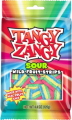
Identified font: Selfie
The top line only. I realize it may be a logo and not a font.


Identified font: Newtext
Thanks. Sorry the sample was low rez, it's all i had.

Thank you, fonatica!
Thank you (very late sorry)

Thanks!! For some reason I was hung up on Dax and it was wrong.

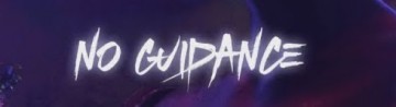
I figured it out. Logotype started out as Novarese but it's drifted quite far.

Identified font: Novarese
The top of the "v" has been curved in that's not part of the original font. Also, thoughts on the 0.1% would be welcome.
Edited on Feb 12, 2019 at 17:18 by elzadra
Edited on Feb 12, 2019 at 17:18 by elzadra

Suggested font: Frankfurter
Thank you jerseygirl.
Procopius is close in style but not as heavy as this one. I'm also pretty sure this is an Adobe font.
Edited on Nov 10, 2018 at 19:49 by elzadra
Edited on Nov 10, 2018 at 19:49 by elzadra
I should totally know this one but I can't think of the name.

All times are CEST. The time is now 18:14
