
Forum
1.319 posts Caratteri Identificati Solo richieste
Posts di elzadra

Thanks!

Carattere Identificato: Selfie
The top line only. I realize it may be a logo and not a font.


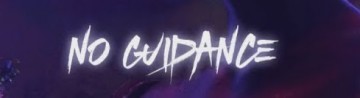
Carattere Identificato: Newtext
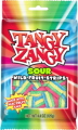
Thanks. Sorry the sample was low rez, it's all i had.

Thank you, fonatica!
Thank you (very late sorry)

Thanks!! For some reason I was hung up on Dax and it was wrong.

I figured it out. Logotype started out as Novarese but it's drifted quite far.

Carattere Identificato: Novarese
The top of the "v" has been curved in that's not part of the original font. Also, thoughts on the 0.1% would be welcome.
Modificato su 12/02/2019 alle 17:18 da elzadra
Modificato su 12/02/2019 alle 17:18 da elzadra

Carattere suggerito: Frankfurter
Thank you jerseygirl.
Procopius is close in style but not as heavy as this one. I'm also pretty sure this is an Adobe font.
Modificato su 10/11/2018 alle 19:49 da elzadra
Modificato su 10/11/2018 alle 19:49 da elzadra
Fuso orario: CEST. Ora sono le 16:00
