
Forum
3,821 posts Identified fonts
Posts by donshottype

Ozzy II, on Dafont since 2012, looks like a copy of Rapscallion, on Dafont before 2005.
Don
Don


Custom font by Ole Schäfer based on his Notes Style Bold Italic
A passable substitute can be made by adding an additional slope of 8 degrees and increasing the width by 105% which yields the result

You have to customize the umlaut over _u_ and the dot in _i_ to get the effect.
Don
A passable substitute can be made by adding an additional slope of 8 degrees and increasing the width by 105% which yields the result
You have to customize the umlaut over _u_ and the dot in _i_ to get the effect.
Don
Identified font: Nürburgring

Not a retail font. A reasonable substitute could be made from some letters in Flange BQ Bold and adding an inline. Other letters are different.
Suggested font: Flange

Identified font: Helvetica Neue 75 Bold
Edited 2 times. Last edit on Oct 08, 2015 at 15:38 by drf

Identified font: Agency Bold

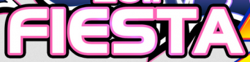
Frankfurter is a match for _DOKIDOKI_
The _6%_ is either edited or from another font.
Don
The _6%_ is either edited or from another font.
Don
Suggested font: Frankfurter

AFAIK not a retail font. Higher rez image might help in locating a font that might have been softened to make the logo

Similar vibe to Tartine Script Bold, particularly the _R_, but Tartine Script has connected letters, and is not the font which was used to make the _White Rain_ logo.
Don
Edited on Oct 08, 2015 at 09:49 by donshottype
Similar vibe to Tartine Script Bold, particularly the _R_, but Tartine Script has connected letters, and is not the font which was used to make the _White Rain_ logo.
Don
Suggested font: Tartine Script Bold
Edited on Oct 08, 2015 at 09:49 by donshottype

Serpentine Bold Oblique for _Vinilos_
_Tuning_ is also Serpentine, but perhaps the Medium weight.
Don
_Tuning_ is also Serpentine, but perhaps the Medium weight.
Don
Identified font: Serpentine
The upper case looks like a version of iron on letters which feature a simplified Old Englsh and are sold in hobby and craft stores. Presumably the lower case has the same source?
This type of font previously discussed here: http://www.dafont.com/forum/read/235556/help-me-font-please
As koeiekat said, the numbers are a rip of Bayern.
@ jss_lua So what will happen to your font? Personal use? Something you hope to sell? Something you intend to share on dafont?
Don
This type of font previously discussed here: http://www.dafont.com/forum/read/235556/help-me-font-please
As koeiekat said, the numbers are a rip of Bayern.
@ jss_lua So what will happen to your font? Personal use? Something you hope to sell? Something you intend to share on dafont?
Don

I was able to enhance an image of the main lettering from another source

This is the result of making a Frankenfont, which may or may not have been made into more than these letters.
Some letters look like Times Roman manually sloped.
Note in particular the _a_, _t_, _o_, _p_, _P_, _r_ and _e_
The _e_ is actually a _c_ with an added central tongue.
The _P_ looks like a _p_ expanded to caps height and edited.
The _r_ looks like a tortured _n_
The other fonts are generic and too small to match with 100% certainty. Quite a few could be substituted for them.
Don
Suggested font: Times Roman

Identified font: Feast of Flesh BB

Identified font: Helvetica Neue
Helvetica Neue Bold, or Helvetica Bold
Don
Edited 2 times. Last edit on Oct 07, 2015 at 07:22 by jerseygirl
Don
Identified font: Helvetica Neue
Edited 2 times. Last edit on Oct 07, 2015 at 07:22 by jerseygirl

Handlettered from a well known old post card.
Here are the letters aligned to a straighter baseline

Some similarity to the Superman font, Up Up and Away, although the _G_ lacks a spur and the font is too light
Don
Here are the letters aligned to a straighter baseline
Some similarity to the Superman font, Up Up and Away, although the _G_ lacks a spur and the font is too light
Don
Suggested font: Up Up And Away
I measured the character width in Indy 17 normal and Indy 17 wide normal.
The width of Indy 17 wide normal is 120.225% of Indy 17 normal
I then expanded the width of Indy 17 bold by the same 120.225% and got the following result

Top of the _t_ needs to be blunted to match _Atlantic_
As for the rest, I don't spot major differences.
Don
The width of Indy 17 wide normal is 120.225% of Indy 17 normal
I then expanded the width of Indy 17 bold by the same 120.225% and got the following result
Top of the _t_ needs to be blunted to match _Atlantic_
As for the rest, I don't spot major differences.
Don
Yes, I found eight.
An alternative explanation is that the makers of _Atlantic_ thickened Wide Normal to make the letters.
Unless this is something pre-digital, in which case all bets are off.
In any case this is an attractive design based on the work of a master.
Don
An alternative explanation is that the makers of _Atlantic_ thickened Wide Normal to make the letters.
Unless this is something pre-digital, in which case all bets are off.
In any case this is an attractive design based on the work of a master.
Don
Bay_Animation's Indy 17 series is interesting.
Indy 17 Normal has the same basic letterforms as Alessandro Butti's Torino for Nebiolo, which is produced as Industrial 736 by Bitstream and as Torino by URW. Industrial 736 is closer to _Atlantic_ than URW's Torino because the thin strokes in Torino are very thin.
Indy 17 also has a wider width, which as koeiekat mentioned, is called Wide Normal.
Indy 17 Normal has a Bold weight which matches _Atlantic_ except that it is not wide enough.
Indy 17 Wide Normal matches _Atlantic_ except that it is not heavy enough.
At some stage there might have been an Indy 17 Wide Bold, which from what I can infer would be an exact match to _Atlantic_.
I can speculate that might have been the source of the letters for _Atlantic_.
Don
Edited 2 times. Last edit on Oct 05, 2015 at 20:40 by donshottype
All times are CEST. The time is now 20:18
