
Forum
13,582 posts Identified fonts Requests only
Posts by Heron2001


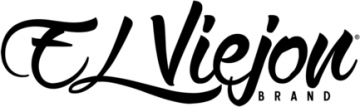

Identified font: Cardenio Modern

Suggested font: Forum

It uses an alternate l that use to be part of the font.
Edited on Aug 27, 2020 at 20:25 by Heron2001
Identified font: Sloop Three
Edited on Aug 27, 2020 at 20:25 by Heron2001
Identified font: DeathRattle BB


If you would like something close and can modify to get closer, take a look at Universal Knowledge.
NOT THE FONT
NOT THE FONT
Suggested font: Universal Knowledge

Looks like Aachen Bold that someone drew a few lines through to make it look like a stencil font.
Identified font: Aachen


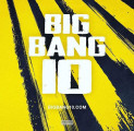
Identified font: Curse of the Zombie

Harold's Fonts made this under two different names. Atlas and Farouk. Now it seems to only go by the name Atlas.
Identified font: Atlas

Identified font: Olympic Branding
You are most welcome. Sorry I couldn't find exact.


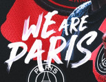
It looks like someone eroded Agency Black -- and used the lower case L for the 1.
Suggested font: Agency Black

Identified font: Comix
All times are CEST. The time is now 03:01
