
Forum
3,821 posts Identified fonts
Posts by donshottype


Identified font: Magneto

Identified font: Corsiva
Identified font: Colonna

Letters have different weights.
Compiled from different sources?
Compiled from different sources?

Identified font: Carson Monogram

Suggested font: Pretorian
Suggested font: Storybook

The style of Tuscan used in the bottom two lines of lettering matches the one in Michel Bujardet's Bujardet Freres font
Around 1900 it was even used to make words and phrases for use as rubber stamps. For back of photographs, passports etc.
Around 1900 it was even used to make words and phrases for use as rubber stamps. For back of photographs, passports etc.
Suggested font: Bujardet Freres

Identified font: Broadway Engraved

Suggested font: Arnold Boecklin (Already suggested here)

Suggested font: Compacta Bold
Primer is a fair match for the bottom two lines, particularly if it is made heavier and compressed
Suggested font: Primer
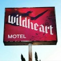
The bottom two lines of lettering are a common split tail terminal design called Tuscan or fishtail.
Partial match with Figgins Tuscan
Partial match with Figgins Tuscan
Suggested font: Figgins Tuscan
I suspect the sign is based on hand lettered alphabets.
The top line is a rendition of Frank Atkinson's Tuscan Roman, as shown in his book in his book Sign Painting, A Complete Manual. Fontry West used the same source to create a font. It is wider and has a less pronounced loop in the cross stroke of _A_
The top line is a rendition of Frank Atkinson's Tuscan Roman, as shown in his book in his book Sign Painting, A Complete Manual. Fontry West used the same source to create a font. It is wider and has a less pronounced loop in the cross stroke of _A_
Suggested font: Tuscan Roman

With some letter-parts clipped and custom informal swirls and capital letters
Edited on Feb 22, 2016 at 11:54 by donshottype
Suggested font: Old English Text
Edited on Feb 22, 2016 at 11:54 by donshottype

Suggested font: Eurostile Extended #2
I mentioned ITC Bauhaus Medium mainly because PF Premier Text is no longer available from a legitimate source

The logo _moto_ is also custom.
Could use ITC Bauhaus Medium, or perhaps ITC Bauhaus Bold, to duplicate if you edit the _t_
Edited on Feb 21, 2016 at 15:59 by donshottype
Could use ITC Bauhaus Medium, or perhaps ITC Bauhaus Bold, to duplicate if you edit the _t_
Suggested font: Bauhaus Medium
Edited on Feb 21, 2016 at 15:59 by donshottype
Suggested font: American Text
All times are CEST. The time is now 21:01
