
Forum
4,435 posts Identified fonts Requests only
Posts by pilaster


Identified font: Clarendon Bold Condensed
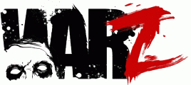
'WAR' is Impact (already on your PC)
The 'Z' looks like custom PS/AI brushed to me (but I have been known to be wrong )
)
Plenty of similar, readymade brush fonts here though
http://www.dafont.com/theme.php?cat=604&page=1&psize=l&text=Z
The 'Z' looks like custom PS/AI brushed to me (but I have been known to be wrong
 )
)Plenty of similar, readymade brush fonts here though
http://www.dafont.com/theme.php?cat=604&page=1&psize=l&text=Z
Identified font: Impact
Just celebrating the great Jack's Man Boobs.
Celebrity MOOBS

malvolio said 
Good searching, pilaster - I wasn't sure if they were alternates or manually swashed.
Top tip Mal:
If you click on the 'Ff' icon in the Myfonts sample text header, you can turn on some of the OT features for the preview. In this case 'Stylistic Alternates'. It don't work for every sample, as you can end up with every letter being an alternate, but it works for this example.
Mal is right with Bickham. Note: the 'S' and 'E' are alternates
http://myfonts.us/td-B0OeRT
http://myfonts.us/td-B0OeRT
drf_ said

Looking at it with my beer goggles on, I think it's Times bold (et al), that's been put through the same treatment as the Trajan of the actual corporate logo i.e. scaled and kerned to within an inch of legibility.
Does PS 6 have some filter to correct camera shake?
(that was unfair) The OP sample on the podium isn't Trajan.
SashiX said
Mmm... shaky image for sure, but... that's not Trajan for me 

http://www.specsavers.co.uk


'Taken with Shaky Cam'?

Nah! That's Century Gothic. (but, of course, the e is still rotated counter clockwise)
Identified font: Century Gothic

Identified font: Coolvetica


With a stroke added the eye of the 'A' closed up and whoever set this has improvised by adding a new, lower crossbar.

Identified font: Liberator
All times are CEST. The time is now 02:55
