
Forum
13,582 posts Identified fonts Requests only
Posts by Heron2001


The distress was added by the designer, because repeating letters do not have the same markings. I think they took Directors Gothic 210, maybe Medium or Bold -- and had fun.
Suggested font: Directors Gothic


Identified font: Rock Salt


Suggested font: Trivial


Identified font: Loveline

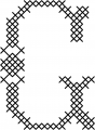
I cannot find this cross-stitch font but if you need a quick substitute, maybe this can help.
NOT THE FONT.
NOT THE FONT.
Suggested font: Tant Lilian

Identified font: Work Sans


Identified font: Janda Manatee
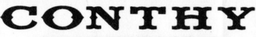
It use to be called Fancy Full and had the Y with the line through it. I do not know when they changed the name or if they added any alternatives.
Identified font: Lone Rider Medium Spurs


All times are CEST. The time is now 23:37
