
Forum
1,700 identified fonts All posts Requests only
Identified fonts by sjh


Only difference is the straight cross bar on the A, so this was apparently based on Shadeerah Light.
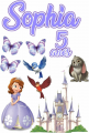
Identified font: Shadeerah

Identified font: Skateboard Unlimited
Identified font: Damion

Identified font: Blooming Elegant Sans

Identified font: Blooming Elegant Hand

Identified font: Astrokids


Identified font: Amithen

Identified font: Deellma

Identified font: Cinzel Decorative

All times are CEST. The time is now 03:25
