
Forum
2,266 identified fonts All posts Requests only
Identified fonts by pilaster


Identified font: Badaboom BB

Identified font: Cocktail Shaker
Monotype Baskerville Pro Roman
Edited on Oct 23, 2012 at 21:54 by Rodolphe
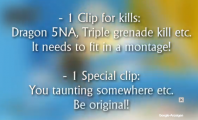
Identified font: Baskerville
Edited on Oct 23, 2012 at 21:54 by Rodolphe
(caps are a larger point size, rather than small caps being used)
Identified font: Monotype Baskerville Pro Italic

Identified font: Sliced Juice

Identified font: Contax Pro

Identified font: Carnivalee Freakshow

Identified font: IFC Hardball

Identified font: Agency FB

here you go
fattened up with FX
Edited on Oct 21, 2012 at 12:41 by pilaster
Identified font: Feel Script
Edited on Oct 21, 2012 at 12:41 by pilaster
Manually bold and slightly condensed (that could just be my eyesight though!  )
)
 )
)Identified font: Albertus

'Rhýannazinha'
The 'R' is an alternate
http://www.myfonts.com/fonts/fenotype/slim-tony/regular/glyphs/561944/103
and it's been manually condensed.
The 'R' is an alternate
http://www.myfonts.com/fonts/fenotype/slim-tony/regular/glyphs/561944/103
and it's been manually condensed.
Identified font: Slim Tony

Identified font: Susa


All times are CEST. The time is now 03:36
