
Forum
1,700 identified fonts All posts Requests only
Identified fonts by sjh


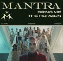
Identified font: Dunbar Tall Ultra


The connection between the e and the r was smoothed out for the shirt, but it is the same typeface.
Identified font: Shorelines Script

The cross in the t was shrunk for the shirt, but it is otherwise the same,
Edited on Sep 18, 2023 at 20:50 by sjh
Identified font: Earthy
Edited on Sep 18, 2023 at 20:50 by sjh

Identified font: Amalfi Coast

Identified font: Tan Mignon


Identified font: Olympic Branding
Identified font: HWT Roman Extended Lightface


Identified font: Sentra

Identified font: Hello Big Deal
Identified font: Questa Grande

Identified font: The Something
Identified font: Amalfi Coast

Actually, I think I have a match. The variable shapes of the N in Jonny are because the typeface has an ON ligature, among others. You can see it in the MyFonts tester if you select the Standard Ligatures item under the ff menu.
Now I should go back and fix _my_ error from a day or two ago. Mea culpa, et. al.
Edited on Sep 13, 2023 at 22:45 by sjh
Now I should go back and fix _my_ error from a day or two ago. Mea culpa, et. al.
Identified font: Psychedelic Xylophones
Edited on Sep 13, 2023 at 22:45 by sjh

Identified font: Majel
All times are CEST. The time is now 07:38
