
Forum
2,266 identified fonts All posts Requests only
Identified fonts by pilaster


Looks like a medium weight, with a slight stroke added (the 'e' looks "closed up")
Edited on Nov 22, 2012 at 12:21 by pilaster
Identified font: Bauhaus
Edited on Nov 22, 2012 at 12:21 by pilaster


Identified font: House Gothic

Identified font: Minion

I'm assuming you mean the ink, not the time or the @address?
Edited on Nov 21, 2012 at 18:01 by pilaster
Identified font: Chopin Script
Edited on Nov 21, 2012 at 18:01 by pilaster

Identified font: Feel Script

Identified font: Felix Titling

Identified font: Demonized

Identified font: Ambrosia

Identified font: Snell Roundhand

Identified font: Avant Garde Gothic


Identified font: Bickham Script
Identified font: Lavanderia


Looks like
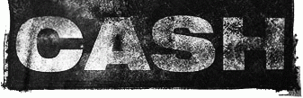
Helvetica 93 Black Extended. I think the erosion is aftermarket.
Identified font: Helvetica 93 Black Extended

Identified font: Birch

Looks like arial to me. till should probably read til, since its an abbreviation of 'until' which only has one 'l'.
Edited 3 times. Last edit on Nov 16, 2012 at 18:35 by pilaster
Identified font: Arial
Edited 3 times. Last edit on Nov 16, 2012 at 18:35 by pilaster
All times are CEST. The time is now 19:36
