
Forum
1,699 identified fonts All posts Requests only
Identified fonts by sjh


There is some modification from the original to get to the sample, but it started from some weight of SFT Sushka.
Identified font: SFT Sushka

The sample is small in size, so an ID is a bit tough. This might be the match, though, for TRULY GREAT
.
Identified font: Blakely Light
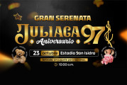
Aniversario. Parts of this were set using a stylistic alternate within the typeface.
Identified font: Milky Brush

Identified font: Sticky Planner Script

Identified font: Drunken Hour

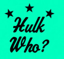
Identified font: The Championship

The text beginning with de posicionar
looks like Light weight, and the part starting Ja párou
in either Semibold of Bold. cloupeis a different typeface: the small l lacks a serif, for example.
Identified font: Sora

Identified font: Haarlem Sans Italic

Identified font: AZ Cut Script

Identified font: Sweet Doughnut


Identified font: ChapterOne

Identified font: Orbiton Bold

Identified font: Sirenik
All times are CEST. The time is now 23:29
