
Forum
1,700 identified fonts All posts Requests only
Identified fonts by sjh


Identified font: Uniwars Semibold

Identified font: Pinyon Script
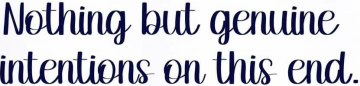
Identified font: Sunday Is Coming


Identified font: Chery Santos
As for the obliqued parts, Qanelas Heavy Italic looks good. Cant tell if Qanelas Soft Heavy is better or not.
Identified font: Qanelas Heavy Italic
The upright parts of the sample (1.8m, 1.2m, etc.) are Berlin Sans. My guess that it is the Font Bureau version, based on the 8. Theres another Berlin Sans out there, but the Bold is too bold, and the 8 looks wrong in Semibold.
Identified font: Berlin Sans


Identified font: Bigelow Rules

Identified font: Sausage

I suspect we have multiple typefaces here. Looks to me like the F (modified), Z, E, D (colored), O, R and T could be set with Akira Expanded, Super Bold.
Identified font: Akira Expanded

Identified font: Algerian


Identified font: Armstrong
All times are CEST. The time is now 07:10
