
Forum
1,695 identified fonts All posts Requests only
Identified fonts by sjh


Your sample has some horizontal compression in it, compared to the original.
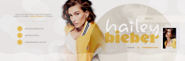
Identified font: LillyBelle

Identified font: Blacksword


Identified font: Rialliata Beautiful
Identified font: Boxtrolls
Identified font: Zubilo

Pretty sure this is it, but you need to set the text in lower case: isabella 4 meses.
Identified font: Supersonic Rocketship

I think it is Conrad Veidt, with a lot of clean up. The glyph outlines are a good match, and there is evidence left of the distressing (the hairs on the K, e.g.).
Identified font: Conrad Veidt

Identified font: Losaenato

Identified font: Atorge

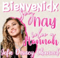
Identified font: Alivia

Identified font: Bickham Script 3

next, alidation. I guess that the l was shortened to accommodate the V from a Creattion. Otherwise, it looks a match to me.
Edited on Mar 28, 2024 at 19:44 by sjh
Identified font: Taken By Vultures
Edited on Mar 28, 2024 at 19:44 by sjh
Alright, heres my take. First, the uppercase V is separate from the rest.
Identified font: Creattion

I think that it is Babel Sans, but the sample is vertically stretched (a lot) from the original.
Identified font: Babel Sans

Identified font: Special Elite

All times are CEST. The time is now 22:05
