
Forum
5,872 identified fonts All posts
Identified fonts by koeiekat


Identified font: HY Kak Headline Bold
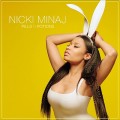
Identified font: Helvetica Neue

Identified font: VNI-HLThuphap
Identified font: Prestige Elite

That is FontDiner's Coffee Service
Edited on May 19, 2014 at 15:36 by Rodolphe
Identified font: Coffee Service
Edited on May 19, 2014 at 15:36 by Rodolphe

Identified font: Concurso Italian BTN

Identified font: Azrael
Identified font: FS Me-Heavy

Identified font: Freebooter Script

Identified font: Sir William

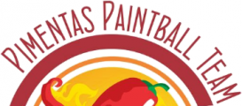
Identified font: FF Netto Bold

A badly made*) copy of the Tabitha (http://www.chank.net/font_detail.php?sku=5425) which is the original font. The S has a wrong advance width, hence the gap before the S.
*)
11 glyphs with intersecting coordinates
75 glyphs with wrong or unknown direction
61 glyphs with redundant nodes
77 glyphs with off-curve extreme coordinates
Edited on May 19, 2014 at 12:59 by koeiekat
*)
11 glyphs with intersecting coordinates
75 glyphs with wrong or unknown direction
61 glyphs with redundant nodes
77 glyphs with off-curve extreme coordinates
Identified font: SpongeFont SquareType
Edited on May 19, 2014 at 12:59 by koeiekat

Click Micra.
The image does not show it alas but it is the R that makes the match.
The image does not show it alas but it is the R that makes the match.
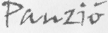
Identified font: Micra
Identified font: John Handy

Identified font: Chopin Script
Identified font: Brassiere

Identified font: A&S Signwriter
All times are CEST. The time is now 20:12
