
Via Appia
in Foreign look > Roman, Greek
125,937 downloads (51 yesterday) Free for personal use - 2 font files
Via Appia.ttfVia Appia Twin.ttfNote of the author
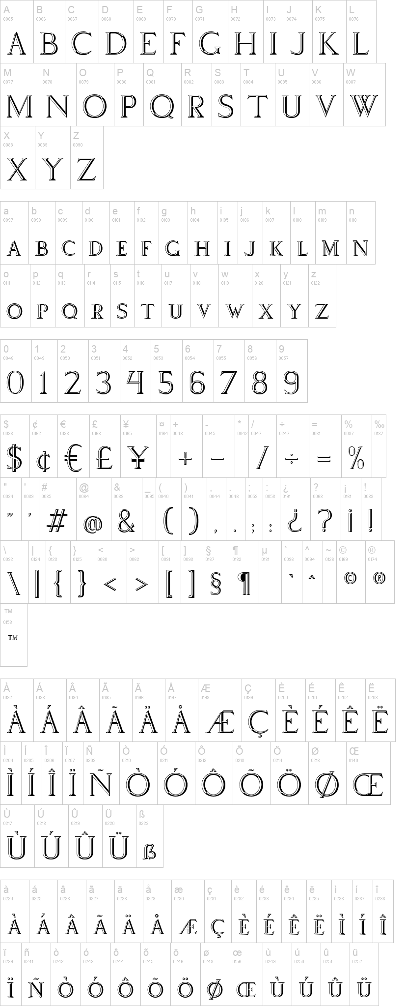
Via Appia's first use is as a title font. The basis is my Pompei font without the flourishes. It's in fact a Roman embossed alphabet.
Remarks or suggestions will be welcome by private message.
Version 2:
Added: Stylistic sets 1 and 2 to convert arabic numerals from 1 to 9999 to roman numerals, some glyphs.
Corrected: mostly lower cases, kerning.
Version 2.004:
Corrected some "optical illusions": A a M m N n 4 8 $ etc.
Version 3:
corrected M,m,N,n,Q,q
Version 3.200:
Corrected kerning VA, WA, va, wa
_____________
Via Appia Twin:
This "shadow" font consists of the originally empty contours in the "Via Appia" font.
In a graphic program, when the same text is typeset in two text frames at the same size, one in the normal font, one in the shadow font, and the frames are exactly overlaid, you get the combined result of letters and shadows. Fill the two frames with different colours or gradients
Cette fonte "d'ombrage" reprend les contours originellement vides de la police "Via Appia".
Dans un programme graphique, si le même texte est inclus dans deux zones de texte de mêmes dimensions et exactement superposées, l'un dans la police normale, l'autre dans la police Twin, le résultat est une combinaison des deux. Remplissez les deux cadres de couleurs ou de dégradés différents.
First seen on DaFont: November 03, 2019 - Updated: November 22, 2024

Via Appia.ttf
Via Appia Twin.ttf

