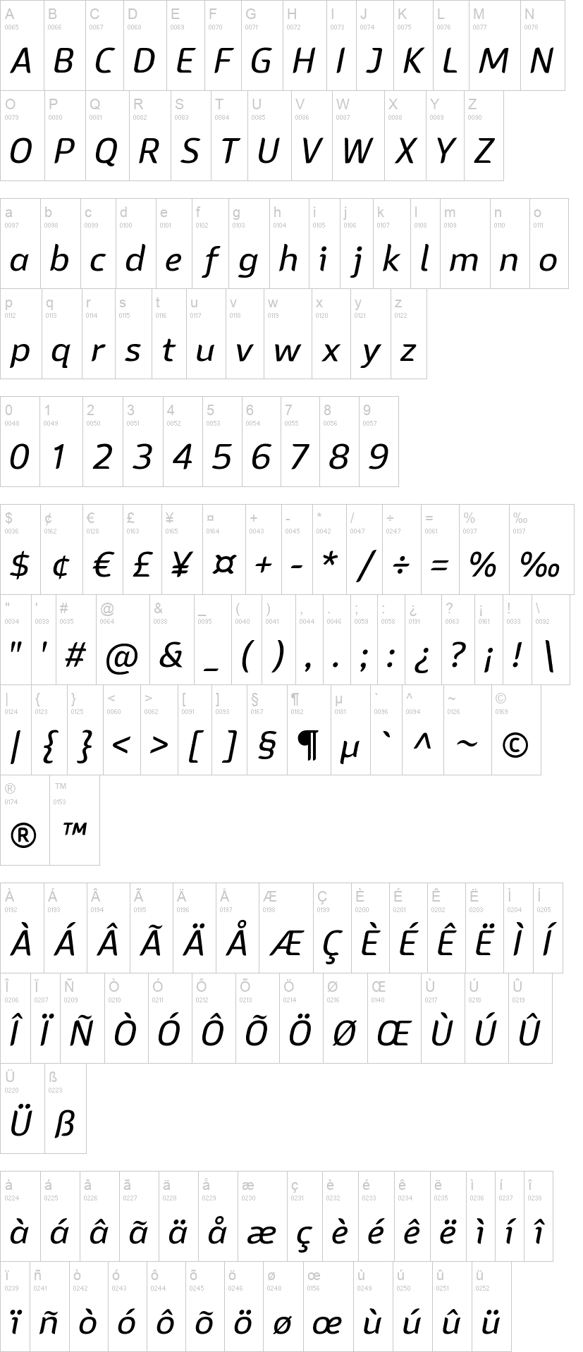
Sans Mateo
in Basic > Sans serif
19,387 downloads (5 yesterday) Public domain / GPL / OFL - 8 font files
Sans Mateo 2 Regular.ttfSans Mateo 2 Medium.ttfSans Mateo 2 Semi Bold.ttfSans Mateo 2 Bold.ttfSans Mateo 2 Italic.ttfSans Mateo 2 Medium Italic.ttfSans Mateo 2 Semi Bold Italic.ttfSans Mateo 2 Bold Italic.ttfNote of the author
The Sans Mateo Font
------------------------------
This sans serif font originally started out as a stripped down version of Bainsley but simplified and completely redrawn. I just needed a test-bed font to try out some new ideas with open type. But after a while I realised that it looked a lot like a bland sans serif just like the thousands of bland sans serif fonts which are available all over the web. So I decided to try to make it a little different and added a few curves to the ends of the stems and limbs.
The font has more than 16 thousand Kerning Pairs and supports fractions, superscript and subscript. As you might have guessed from the fact that this was built as a test-bed font for new ideas with open type it has a lot of open type features. Stylistic set 01 turns the single storey 'g' into a two storey 'g', Stylistic Set 02 is only available in Dutch and cancels the localisation of IJ ligatures, if anyone wants to do this.
The default is tabular numbers but this can be swapped for proportional numbers using the 'pnum' function.
The open type features supported by this font are :-
Capital Spacing
Case sensitive forms
Denominators
Discretionary Ligatures
Fractions (advanced)
Kerning
Diacritic Marks positioned correctly by anchors
Numerators
Ordinals (including st,nd,rd and th)
Stylistic set 01 turns the single storey 'g' into a two storey 'g'
Proportional and Tabular Figures
Scientific Inferiors
Subscripts
Superscripts
and Localisation for many European Languages
___________________________________________________________________________________________________________________________________ More...
First seen on DaFont: October 24, 2022
Sans Mateo 2 Regular.ttf

Sans Mateo 2 Italic.ttf


