Neuropol X
663,364 downloads (84 yesterday) 100% Free
Neuropol X Rg.otfNote of the author
Neuropol X stands as a testament to the enduring power of visionary typography. Born from the iconic Neuropol typeface of 1996, this enhanced iteration captures the essence of Y2K optimism while evolving to meet the demands of contemporary design.
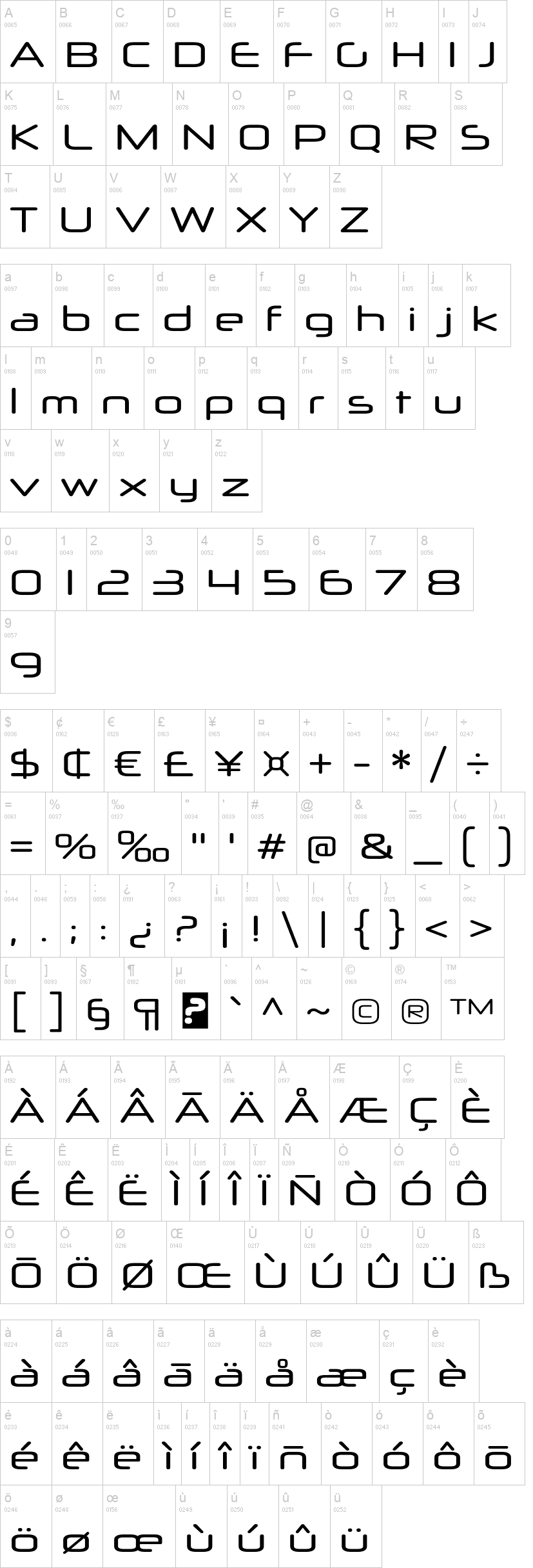
With its broad, futuristic letterforms, Neuropol X transports us to an era when technology promised infinite possibilities. The smooth, plastic-like strokes evoke the sleek gadgetry and digital interfaces that defined the turn of the millennium. Truncated curves and rounded terminals echo the aesthetics of laser beams, circuit boards, and oscilloscope readoutsvisual elements that came to symbolize our collective dreams of a high-tech future. This expanded font family offers unprecedented versatility, featuring five weights, three widths, and accompanying italics. Such range empowers designers to craft everything from subtle, sophisticated layouts to bold, attention-commanding headlines. Whether youre developing a cutting-edge website, crafting a retro-futuristic brand identity, or designing a forward-thinking publication, Neuropol X provides the typographic tools to realize your vision.
Neuropol Xs appeal transcends mere nostalgia. Its forms speak a visual language that resonates across cultures and writing systems. From the intricate accents of Vietnamese to the laser-like scripts of Greek and the techno strokes of Cyrillic, this typeface family adapts seamlessly. Its as comfortable displaying Swedish text as it is setting German prose or Russian headlinesa truly global typeface for our interconnected world. By choosing Neuropol X, youre not simply selecting a font; youre tapping into a rich design legacy. Its a typeface that has inspired countless creatives, leaving its mark on album covers, movie posters, and digital interfaces. Yet, it remains as fresh and relevant today as it was at the dawn of the new millennium. More...
First seen on DaFont: October 15, 2006 - Updated: November 26, 2024