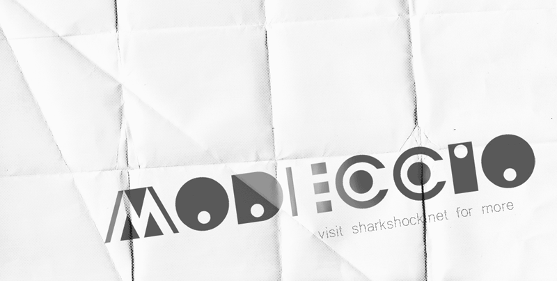
Modeccio
Modeccio by Sharkshock 
in Fancy > Decorative
Modeccio.ttfNote of the author
Hi font lovers. I give you Modeccio. (Try saying it with your best Italian accent) This is my 4th installment of the creative series. Art Deco? Abstract? Geometrical? Probably not but
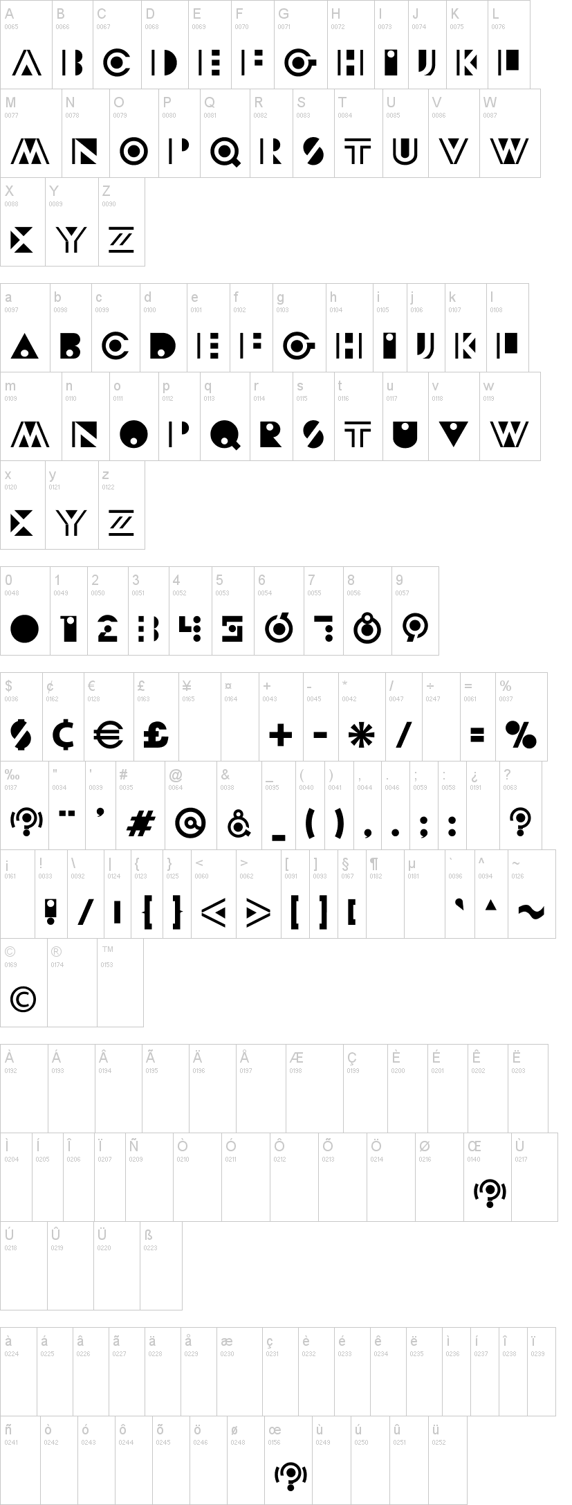
there are elements of all. You be the judge. It's a huge play on shapes, ellipses, and negative space. Kerning is included. Most lowercase glyphs borrow from their uppercase counterparts but
there are some different ones in there. One can type in caps/lowercase alternately for a pleasing appearance. This typeface, like my others, are free for personal use only. For commercial use
please contact me at dennis@sharkshock.net to discuss an end user license.
visit sharkshock for more!
First seen on DaFont: January 26, 2015


