Galderglynn Esquire
in Basic > Sans serif
Galderglynn Titling Hl.otfGalderglynn Titling Th.otfGalderglynn Titling El.otfGalderglynn Titling Lt.otfGalderglynn Titling Rg.otfGalderglynn Titling Bd.otfGalderglynn Titling Bl.otfGalderglynn Titling Hl It.otfGalderglynn Titling Th It.otfGalderglynn Titling El It.otfGalderglynn Titling Lt It.otfGalderglynn Titling Rg It.otfGalderglynn Titling Bd It.otfGalderglynn Titling Bl It.otfNote of the author
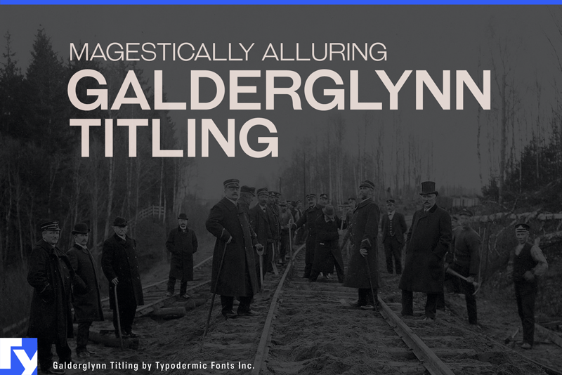
Step into the captivating world of Galderglynn Titling, an all-caps typeface that channels the spirited essence of 19th-century sans-serifs with a modern twist. This isnt your average historical revivalits a bold celebration of typographic heritage that dances to its own beat.
Galderglynn Titling embraces delightful inconsistencies, with each character exuding its own personality. Its as if the letters have come alive, jiving across the page with infectious energy. This typeface is tailor-made for designers who want to infuse their work with a touch of whimsy and historical charm. Versatility is Galderglynn Titlings middle name. With a smorgasbord of numeral stylesstandard, monospaced, old-style, inferior, and superiorits ready to tackle any typographic challenge you throw its way. The seven weights offer a playground of possibilities for designers who dare to think differently.
This typeface doesnt just cross linguistic bordersit leaps over them with gusto. Supporting an impressive array of Latin-based European and some Cyrillic-based writing systems, Galderglynn Titling ensures your message maintains its quirky charm whether youre writing in Albanian or Zulu. What sets Galderglynn Titling apart is its free commercial use desktop license, making it an accessible choice for a wide range of projects. For those needing expanded functionality like web or app embedding, or seeking lowercase letters, the full Galderglynn Esquire family is available from Typodermic Fonts.
Choose Galderglynn Titling when you need typography that doesnt just speakit shouts with joy and character. Its perfect for headlines, logos, and anywhere you want to make a bold, historical statement with a modern flair. And if you ever need to rein in its exuberance, its well-behaved sibling, Galderglynn 1884, is just a click away. Inject some joyful irreverence into your designs and let your typography tell a story all its own. More...
First seen on DaFont: June 30, 2015 - Updated: November 26, 2024