
Forum
4 posts Requests only
Posts by smartassjeff
Close- but not it.
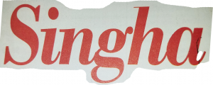
Well after a lot of adjusting and stretching - that is not the font.
The tails at the end of the i n a as well as the top of the h an all too fat.
Well after a lot of adjusting and stretching - that is not the font.
The tails at the end of the i n a as well as the top of the h an all too fat.
Same old story. Client does not have their OWN logo- or know the font.
Closest I have found is Times bold italic - BUT top of g and h are different.
Asking for help from the masses.
Thanks in advance.
Closest I have found is Times bold italic - BUT top of g and h are different.
Asking for help from the masses.
Thanks in advance.
Close- but not the font. The leg on the R does not have the hump the the to of the T has points.
I need to replace this lettering- and of course they can not remember the font. The top of the T has a bow in it. (lower in the center than the ends.) Anyone recognize it?

All times are CET. The time is now 12:14
