
Forum
67 posts Identified fonts Requests only
Posts by calebyourmaster
But the s, m and the a are slightly different so it's gotta be something similar.

the c is different do to altering...

Identified font: Freestyle Script

Suggested font: Impact MT
you da man.
what is it

FTH!!!


hey what is this?

obviously thats a sideways M instead of an e........
You rock.
i confused


It looks like Klavika to me...with the italic lower case a somehow straightened out...hmm...
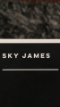
Suggested font: Klavika

i need it...:(
the car town logo font of course...

the car town logo font of course...

im curious myself...id love this font
All times are CEST. The time is now 20:07
