
Forum
37 posts Identified fonts Requests only
Posts by zerodeluxe

I found 'OnRamp' which is similar-ish... but maybe too square...
Anyone?!
Edited on Oct 03, 2013 at 14:37 by drf
Anyone?!

Suggested font: Onramp
Edited on Oct 03, 2013 at 14:37 by drf

Hey all
Can anyone recommend anything that might be similar to this, or even the actual typeface? Sure I've seen something like it, but mind gone blank!
Thanks in advance!
Ben
Can anyone recommend anything that might be similar to this, or even the actual typeface? Sure I've seen something like it, but mind gone blank!
Thanks in advance!
Ben


No-one? Still not having any joy myself on this one...

Not exact, but could be Plakatbau??
Edited on Apr 29, 2013 at 15:19 by drf_
Suggested font: BD Plakatbau
Edited on Apr 29, 2013 at 15:19 by drf_

Hey
Anyone happen to know what this might be please?! Need it for some artwork, but can't place it!
Thanks!
Ben

Anyone happen to know what this might be please?! Need it for some artwork, but can't place it!
Thanks!
Ben

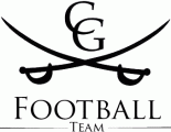
The 'C' and 'G' are Book Antiqua, if you wanted those also.
Edited on Mar 12, 2013 at 16:50 by drf_
Identified font: Book Antiqua
Edited on Mar 12, 2013 at 16:50 by drf_


Garamond has some of those characteristics.... although the 4 isn't that small... so maybe not too helpful... 

Oh... actually, this is 'River'.... exactly, by the looks of it.... http://www.fontsquirrel.com/fonts/sedgwick-co
Okay, so I got my reply from Kate. Unfortunately it didn't do much to persuade me that this wasn't deliberate. She now claims the similarity with Slice and MK Stencil is 'by chance' (and backtracked on the Klein being the copy claim), as with 'Bleacher/New Athletic' and 'Midwest/Legend' also (There is base work to back up those last ones apparently, but is "backing down" due to Mo's threat of legal action over it, suggesting it's not very convincing - or existent) .... Apparently she's also apologised to the designers of the real versions too. I wonder if the customers will get one?
River, City, Rounder, Quadrant are all still claimed as "hers", but after a bit more searching, 'Archive' on Font Fabric (http://fontfabric.com/archive-free-font/) seems to be the basis for 'Rounder' (check the flat headed ampersand), and 'River' does bear a striking resemblance to House Industries 'United Extended' (http://www.houseind.com/fonts/unitedcollection/viewfonts). Not exact, but enough to raise suspicion.
So there we have it. I don't think she was maliciously deceptive in stealing the fonts, but I'm certainly sure she thought she wouldn't be caught. Thanks for helping me to find the matches and reassure me I wasn't way-off track with my doubts, and hopefully now she won't be doing this again in the future.
Ben
(Oh - and she considers this thread to be getting 'petty'. Fancy linking up all those fonts to other people's work, eh? How childish of us.)
All times are CEST. The time is now 00:08
