
Forum
21 posts Identified fonts
Posts by KELGE

Identified font: Gazz
Supernaturalfan941 said 
Which style is this?
Semi Bold


Identified font: Corton

According to Pentagram's portfolio (Pentagram updated the Rotten Tomatoes brand identity), they modified Maax for the wordmark. You can read more about the rebrand on Pentagram's website: https://www.pentagram.com/work/rotten-tomatoes/story
Edited on Nov 25, 2018 at 15:00 by KELGE
Identified font: Maax
Edited on Nov 25, 2018 at 15:00 by KELGE

For the actual prop, they didn't use a font, as it was handwritten by Miraphora Mina (one of the main graphic designers on all the Harry Potter and now Fantastic Beasts films).
The font you see here is a recreation which made by a fan (you can read about that here: http://10digitdesign.blogspot.com/2014/08/the-perfect-hogwarts-acceptance-letter.html)
The font you see here is a recreation which made by a fan (you can read about that here: http://10digitdesign.blogspot.com/2014/08/the-perfect-hogwarts-acceptance-letter.html)
Identified font: 4 Privet Drive

A custom typeface designed by Dalton Maag for AT&T (who now own what used to be Time Warner Inc.). As a custom, proprietary typeface, it is not publicly available.
Suggested font: AT&T Aleck Sans

The 2018 France TV rebrand extensively uses Brown (as ellouder2OMG already indicated). You can read more about this rebrand from (the Paris-based creative studio responsible for the rebrand) Movement at the links below:
http://www.movement.paris/works/france-tv/
http://www.movement.paris/works/franceinfo/
http://brandingsource.blogspot.com/2018/02/dotted-logos-for-french-public-tv.html
French links:
https://www.grapheine.com/actulogo/france-televisions-nouveau-logo ("Pour la typographie, voulant rester dans l'esprit de franceinfo:, on ne change pas une équipe qui gagne et on reprend l'utilisation de la Brown (en version Bold pour les logos)...")
http://www.weneedcafeine.com/nouvelle-identite-de-france-tv-branding/ ("Cest lautre point important de la nouvelle identité de France TV : lutilisation de la typographie Brown pour tout le monde. ")
https://www.francetvinfo.fr/economie/medias/france-televisions/de-nouveaux-logos-apparaissent-sur-les-chaines-de-france-teleivisions_2583446.html ("Le groupe adopte également une nouvelle typographie, passant de l'Heldustry à la Brown, plus ronde et déjà utilisée par la chaîne et le site franceinfo.")
The exact font is AntiqueBlack by Dover Publications from "24 Gothic Display Fonts".
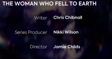
The Doctor Who production team have started using Axiforma as the brand's font.
Identified font: Axiforma

Suggested font: TFArrow

Identified font: Bureau Grot Compressed Medium

Custom proprietary font by Fontsmith: https://www.fontsmith.com/blog/2015/06/15/emotive-automotive
Edited on Sep 27, 2018 at 10:30 by frd
Identified font: Renault Life
Edited on Sep 27, 2018 at 10:30 by frd
Modified. Find out about how the logotype was developed here: https://www.behance.net/gallery/44248007/Uber-Rebrand-Logotype
Hi MidnightStorm. I see andrewscorke has already suggested my remake of the American Horror Story font. I'd just like to inform you that I've updated the font to make it a bit more accessible through the addition of a second style called "Promo".

Suggested font: Tungsten Condensed Bold
Identified font: Olga
gonfer00 said
KELGE said
The Doctor Who team have started using Axiforma as part of the rebrand.
Axiforma
Axiforma
The description of that font is fun.

It is rather, isn't it?
The Doctor Who team have started using Axiforma as part of the rebrand.
Edited on Jul 16, 2018 at 20:56 by KELGE
Identified font: Axiforma
Edited on Jul 16, 2018 at 20:56 by KELGE
All times are CEST. The time is now 23:45
