
Forum
53 posts Identified fonts
Posts by andrewscorke

Suggested font: Pandorica
The Doctor Who production team have started using Town Display for the show.
Identified font: Town Display

It's a custom typeface for Coca-Cola called TCCC Unity. You can read about the typeface here: https://www.printmag.com/daily-heller/tccc-unity-new-coke-classic-neville-brody/
Identified font: TCCC Unity

It's a customised version of Sharp Grotesk (https://sharptype.co/typefaces/sharp-grotesk/), called Prime Video Sharp for Prime Video's rebrand (https://www.pentagram.com/work/prime-video/story).
Identified font: Prime Video Sharp

Identified font: Penny Lane


It's a customised version of Sharp Grotesk (https://sharptype.co/typefaces/sharp-grotesk/), called Prime Video Sharp.
Identified font: Prime Video Sharp
Most likely, just as with Amazon's Wheel of Time series, it's custom. So you're not going to get it.

A custom typeface for Channel Four. Read more here: https://www.dezeen.com/2015/09/30/neville-brody-bespoke-typefaces-channel-4-rebrand-4creative-jonathan-glazer-dblg/ and https://www.typeroom.eu/article/neville-brody-s-channel4-fonts-are-most-talked-about-month
Identified font: Horseferry
It's not a font.

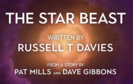
Just like everything else related to the current Doctor Who brand, it's still Axiforma.
Identified font: Axiforma

It's a customised version of their custom typeface Sky Text.
Suggested font: Sky Text


This is Barlow Condensed ExtraBold Italic. There are three different versions of Barlow available Google Fonts: Regular, Semi Condensed, and Condensed.
Identified font: Barlow Condensed


If you'd like similar typefaces, I'd suggest:
Gill Facia: https://www.myfonts.com/fonts/mti/gill-facia-mt/
English Engravers Roman: https://www.myfonts.com/fonts/smith-hands/english-engravers-roman/
Edited on Feb 23, 2021 at 00:30 by frd
Gill Facia: https://www.myfonts.com/fonts/mti/gill-facia-mt/
English Engravers Roman: https://www.myfonts.com/fonts/smith-hands/english-engravers-roman/
Suggested font: Gill Facia
Edited on Feb 23, 2021 at 00:30 by frd

All times are CEST. The time is now 03:55
