
Forum
3,821 posts Identified fonts
Posts by donshottype

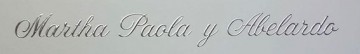
Altast Greeting is perhaps the the most likely name for this script digitized in the early 1990s. It has various other names including Alto Greeting Script, Happy Birthday, Alton Greeting. None of them has a current legitimate download. The pre-digital font went under the name American Greeting.
Greeting card companies use their own names for the script. Crane calls it Kensington.
The image is rendered from the OPTI clone, released as Alto Greeting Script

Edited on Aug 16, 2016 at 19:48 by donshottype
Greeting card companies use their own names for the script. Crane calls it Kensington.
The image is rendered from the OPTI clone, released as Alto Greeting Script
Identified font: Altast Greeting
Edited on Aug 16, 2016 at 19:48 by donshottype
Identified font: Blair Medium


Adjusted to make it work for embroidery
Identified font: Ravenscroft
Edited on Aug 16, 2016 at 15:05 by donshottype

Identified font: Rodchenko Bold

Impact matches _RIFFI_
The other letters of _FLOYD GRIFFIN_ look like horizontally stretched versions of Impact
The other letters of _FLOYD GRIFFIN_ look like horizontally stretched versions of Impact
Identified font: Impact

Identified font: Cambria Bold

Identified font: Diamante ExtraBold
Monotype Corsiva redrawn with inconsistent bolding and edits: Swash on _B_ pulled back to fit logo space, connector on _a_ sharpended at base and lengthened, connector on _e_ lengthened, connector pasted between _S_ and _h_, connectors on _h_ and _p_ lengthened, base serif on _p_ clipped.
As for the bolding some parts are close to Monotype Corsiva Bold, available at Linotype https://www.linotype.com/1249835/monotype-corsiva-bold-product.html, but others are not.
IMHO a clumsy rework by the logo maker.
As for the bolding some parts are close to Monotype Corsiva Bold, available at Linotype https://www.linotype.com/1249835/monotype-corsiva-bold-product.html, but others are not.
IMHO a clumsy rework by the logo maker.
Identified font: Corsiva

Identified font: Add City Boy

The original titles for Stanley Kubricks movie Dr. Strangelove were designed by Pablo Ferro.
The thin letters have been digitized by several font makers but AFAIK nobody has produced a font based on the heavy letters used for _STRANGELOVE_
For a very approximate substitute you might try Troika
Perhaps somebody else can suggest something closer.
The thin letters have been digitized by several font makers but AFAIK nobody has produced a font based on the heavy letters used for _STRANGELOVE_
For a very approximate substitute you might try Troika
Perhaps somebody else can suggest something closer.
Suggested font: Troika

OL Signpainter Titling is not quite as close but it includes shadow effects.
Suggested font: Signpainter Titling
Painted letters, perhaps from a template, the top half on an arc with resulting distortion means that an exact match to a font is unlikely.
The closest seems to be ITC Symbol Bold
The closest seems to be ITC Symbol Bold
Suggested font: Symbol Bold
Good info. 
For anyone wishing to attempt something similar, Rhode Medium Condensed can be purchased from https://store.typenetwork.com/foundry/fontbureau/fonts/rhode
CAUTION: It is perhaps safe to use the results of such an exercise for personal use but anything beyond that raises the prospect of infringement action by the copyright/trademark holders.
Edited on Aug 15, 2016 at 18:56 by donshottype

Looks like Impact with some minor adjustments -- shortened length of tips on _S_ etc.-- and pasted on tiny serifs and medial spurs
Suggested font: Impact

Suggested font: Bauer Bodoni Roman (Already suggested here)

No match so far.
Horizon & Long Shot have some similarities but are NOT THE FONT.
Star -- NOT THE FONT -- has about the same proportions, and has similar angled terminals. But they are not all in the same locations or direction as the letters in the image.
If the outside corners on Star were made square and Star's angled terminals were relocated, Star would work as a substitute.
Edited 4 times. Last edit on Aug 15, 2016 at 09:40 by donshottype
Horizon & Long Shot have some similarities but are NOT THE FONT.
Star -- NOT THE FONT -- has about the same proportions, and has similar angled terminals. But they are not all in the same locations or direction as the letters in the image.
If the outside corners on Star were made square and Star's angled terminals were relocated, Star would work as a substitute.
Suggested font: Star
Edited 4 times. Last edit on Aug 15, 2016 at 09:40 by donshottype

Franklin Gothic Extra Condensed, a width that is available from Scangraphic, Monotype, Linotype, Adobe and Bitstream
Edited 3 times. Last edit on Aug 14, 2016 at 13:19 by donshottype
Suggested font: Franklin Gothic ExtraCond (Already suggested here)
Edited 3 times. Last edit on Aug 14, 2016 at 13:19 by donshottype


Mahogany Script (aka Monterey in the Bitstream version) with the bouncy baseline made level and the swashes on _F_ and _M_ adjusted.
Perhaps somebody made this as a font?
Perhaps somebody made this as a font?

Suggested font: Mahogany Script
All times are CEST. The time is now 00:25
