
Forum
2,259 posts Identified fonts Requests only
Posts by skomii

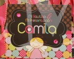
Identified font: Mr Canfields
You got carried away. Take care. 

De rien!

Identified font: Arista Pro
Beautiful ...


Identified font: Roof Runners

Identified font: Percolator

Suggested font: Monotype Engravers

You're welcome !!!
nadanop said 
yes please
The same font suggested.

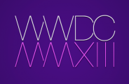
Helvetica Neue Pro UltraLight, with the W flipped vertically to look like a M, and with a good eye, I bet the X was flipped vertically too. You can make the comparison in this image:

Do you agree ???
Edited on Apr 26, 2013 at 04:09 by skomii
Do you agree ???
Identified font: Helvetica Neue Pro UltraLight
Edited on Apr 26, 2013 at 04:09 by skomii

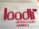
Identified font: Painted


All times are CEST. The time is now 04:21
