
Forum
13,711 posts Identified fonts
Posts by koeiekat


Identified font: Baskerville Old Face

Identified font: Eagle

Identified font: Effloresce

Identified font: Vivaldi

No need to scream. You only take the risk of ending up on an ignore list. Not really what you want I assume.
Identified font: Dream Orphans

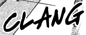
Hill House is a dirty copy of the Rennie Mackintosh. Note the difference in height of the T and the I.
Identified font: Hill House
Identified font: Write Off

Identified font: Gabriel Weiss' Friends

Identified font: Jellyka - Estrya's Handwriting

@sandrolt4
It is not the OPTISybaris nor the Symphony by Profonts. Look at the details as the length of the stem of the p and the bottom of the stems of the p, m and n. The typeface as shown, from the times of letterpress, has probably never made it to the digital age but may very well be an ancestor of these two.
It is not the OPTISybaris nor the Symphony by Profonts. Look at the details as the length of the stem of the p and the bottom of the stems of the p, m and n. The typeface as shown, from the times of letterpress, has probably never made it to the digital age but may very well be an ancestor of these two.
Identified font: FF DIN

A > possibly flipped V Kingthings Trypewriter but probably not.
Edited on Jun 23, 2015 at 22:07 by Rodolphe
Suggested font: Kingthings Trypewriter
Edited on Jun 23, 2015 at 22:07 by Rodolphe
It means that it is a digital version of an existing typeface as is the one by Profonts which is years after Castcraft's version. Claude will know which is the name of the original typeface as his Aerolite CP Two is also a revival of that original.
Notice the different J in the Sybaris regular and bold.
Notice the different J in the Sybaris regular and bold.
This one has many names. Go for Calligraph by Anatole & Alexandra Gophmann, Aristocrat and Script-C650 by Brendel Informatik, Calligraphia by Brendel Informatik and SoftMaker Software, Fleetwood by the FontBank and Weatherly Systems, Inc, Partridge by Broderbund Software, Kalligraphia by Weatherly Systems, Inc. or GE Fleet by Graphx Edge.
OK, after some digging, a similar m and n are there in the OPTISybaris, Claude's Aerolite CP Two and Bob Alonso's Alexandra Script and well hidden in the alternates of the Symphony Pro and OPTISybaris Supplement. None match though. Which is to be expected with this probably hand traced/drawn sample image.
All times are CEST. The time is now 07:34
