
Forum
13,580 posts Identified fonts Requests only
Posts by Heron2001


Obrigada por nos escolher e confiar
Edited on Aug 13, 2021 at 12:29 by Heron2001
Suggested font: Allura
Edited on Aug 13, 2021 at 12:29 by Heron2001


When I gave you Catalpa, there was only an O, M and I showing. The S is strange and the closest I could find was K22 Gadget. Not exact, but a very simple modification.
NOT THE FONT
NOT THE FONT
Suggested font: K22 Gadget
Suggested font: Catalpa Extrabold

Identified font: Oswald Stencil
The other manufacturers didn't include this weight - only Elsner+Flake did. Closest I can find you is this one.
Suggested font: Flyer
The manufacture of Albertus didn't digitize the Extrabold... there are ripoffs all over the network but no real link.
Identified font: Albertus Extrabold

Identified font: Kavoon

It looks like Trans Robotics Extended that someone did "cuts" to it.
Suggested font: SF Transrobotics

Identified font: Marck Script

I'm sorry, I can't find it But if you want something to modify to come close I recommend PunkRocker Stamp
NOT THE FONT!
NOT THE FONT!
Suggested font: PunkRocker Stamp

Suggested font: Herman Decanus AH
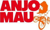
Identified font: Futura Extra Black

This use to be a Letterhead font named Pilsner Alternates. They are no longer carrying it.
Identified font: Pilsner Alternates


Identified font: Luckiest Guy
The font name is THE선인장 Regular
Edited on Aug 05, 2021 at 15:08 by fonatica
Identified font: THE선인장 / THECactus
Edited on Aug 05, 2021 at 15:08 by fonatica
All times are CEST. The time is now 02:38
