
Forum
13,581 posts Identified fonts Requests only
Posts by Heron2001


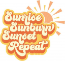
Commercial font with the alternates (like your R in sunrise) is available - https://creativemarket.com/figuree.studio/4130892-Bratsy-Retro-Font
Identified font: Bratsy Script

Identified font: Al Fresco

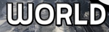
Identified font: Kaleidos

Identified font: Leslie Dawn
Identified font: Montserrat Alternates

Promoting Inclusion of Elders in Wales is too small for my eyes, but I think it might be Work Sans.
Suggested font: Work Sans
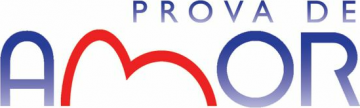
The M is probably custom made for the logo, and the closest I can find for your AOR would be Goya Light.
Suggested font: Goya

Suggested font: MADE Future X Header
Thank you Don.
BTW - it doesn't matter, I believe the person who has a project to work on needs a font... the OP has that!
Edited on Sep 04, 2021 at 16:04 by Heron2001
BTW - it doesn't matter, I believe the person who has a project to work on needs a font... the OP has that!
Edited on Sep 04, 2021 at 16:04 by Heron2001
Morning Marty - thank you for writing the Q doesn't match, because you know as part of my continuing education, I would have written you as to what you thought wasn't a match.
It is a match, Don - It looks like Marty only looked at the lighter weights - where the tail did not really meet up to the Q. When he has his coffee, I am sure he will check again.
It is a match, Don - It looks like Marty only looked at the lighter weights - where the tail did not really meet up to the Q. When he has his coffee, I am sure he will check again.

Identified font: Evol
Edited on Sep 06, 2021 at 01:46 by frd


Identified font: Beautiful Bloom
Suggested font: Bloomer
You are welcome, I'm glad I could help. Good luck with the project.

I am not sure where the exclamation mark came from - Blacksword's doesn't match up to it but looks much better!
Suggested font: Blacksword

Identified font: Essendine 2
All times are CEST. The time is now 23:59
