
Forum
201 posts Identified fonts Requests only
Posts by rayhan

Suggested font: Gosub
@weknow : you beat me.... Ah, gpp kok, hehe.... Org Indo kan?
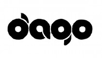
The letter g is modified.... Maybe that's an upside-down letter b.
Suggested font: Chewed Kandi (Already suggested here)
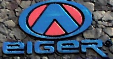
I think that logo used more than one font. But I'm not sure what font is it. The letter l,i,g,n,r,o looks like Avant Garde.
thanks!

If you use laptop or netbook, make a wide angle between the screen and the keyboard. So, the appearance becomes darker and the font will looks more clear.


Thanks!

This is similiar to this font.
Edited on Oct 05, 2011 at 11:21 by drf_
Suggested font: Minecraft Z2font
Edited on Oct 05, 2011 at 11:21 by drf_


very fast... 


Wow, very fast! Thanks, rocamaco.


Identified font: Aria Penci Roman
All times are CEST. The time is now 05:27
