
Forum
3,821 posts Identified fonts
Posts by donshottype


Good comparison koeiekat. By chance I also chose _S_ for my detailed check.
Possibly both digital fonts were created by scanning a printed version. Alternately a conversion from a bitmap font from circa the 1990s.
The internal font info in the Tiara currently "in the wild" says the vendor is ATEC Page Technology Marketing. Inc.
Their website says "Since 1993, Page Technology Marketing, Inc. (PageTech) has specialized exclusively in HP® PCL® print-stream transformation, Intellifont® and TrueType Typeface font utilities and other related PCL technologies."
Anyway, both fonts are based on the old woodtype called Ironwood.
Ironwood is not identical with the letter shape but has well engineered outlines that could be modified to make a match.
Identified font: Ironwood
Same font. Identical character heights, but two widths.
The narrower version, Tiara, looks like a match
Not enough info to say for certain, but both may have been created as Mac fonts and converted to Windows ttf.
Tiara is an orphan with no legitimate download.
Horizontally compress Judas Caps and you could have a match.
The narrower version, Tiara, looks like a match
Not enough info to say for certain, but both may have been created as Mac fonts and converted to Windows ttf.
Tiara is an orphan with no legitimate download.
Horizontally compress Judas Caps and you could have a match.
Also available under the names Wedding Text and Wedding
Edited on Oct 11, 2016 at 10:40 by frd
Identified font: Linotext
Edited on Oct 11, 2016 at 10:40 by frd

Identified font: Ondine
... late by a minute...

Suggested font: Latin Wide (Already suggested here)
Identified font: Copperplate Gothic 33 BC

Identified font: Dynamo
This might help with the ampersand


Tourist post card from the 1940s, or possibly the 1950s. Earliest date is 1942, when Brush Script, used on the postcard for the word _Illinois_ was produced as a font.
The words _RIVER FOREST_ are custom and there is no font from the era that is reasonable match.
Heavy boxy lettering was fashionable in the 1940s.
The lettering of Alf Becker was particularly influential in the 1940s.
Check out, for example, his alphabet of the month published in June 1937.
Versions of it have been made into fonts by The Fontry [see link below] and by Letterhead Fonts, as LHF Pipeline http://myfonts.us/td-wK3zz5
Either font could be edited to make a match.
Edited 2 times. Last edit on Oct 12, 2016 at 01:23 by donshottype
The words _RIVER FOREST_ are custom and there is no font from the era that is reasonable match.
Heavy boxy lettering was fashionable in the 1940s.
The lettering of Alf Becker was particularly influential in the 1940s.
Check out, for example, his alphabet of the month published in June 1937.
Versions of it have been made into fonts by The Fontry [see link below] and by Letterhead Fonts, as LHF Pipeline http://myfonts.us/td-wK3zz5
Either font could be edited to make a match.
Suggested font: ARB-66 Neon JUN-37
Edited 2 times. Last edit on Oct 12, 2016 at 01:23 by donshottype

EDITED:
Squeezed, run together and skewed produces a result like this but I have doubts that this is the font.
Edited on Oct 10, 2016 at 11:47 by donshottype
Squeezed, run together and skewed produces a result like this but I have doubts that this is the font.
Suggested font: Obelix Pro
Edited on Oct 10, 2016 at 11:47 by donshottype

If this is the original logo from 1928 it would have been a custom design, perhaps inspired in part by the geometric Bauhaus alphabet prototype created in 1925 by Herbert Bayer, a professor at the Bauhaus school in Dessau, Germany.
Compare the _E_, _e_, _o_ and to ITC Bauhaus, which is similar but NOT THE FONT.
The squared _t_ in the image might have been inspired in part by idea of using squared sections instead of curves that was used for some letters, but not _t_, in Paul Renner's original Futura
http://www.myfonts.com/fonts/wiescherdesign/futura-classic/
Larger scale image of the logo at http://www.electrovolet.be/
Suggested font: Bauhaus
The German version of the title is clearly Agency Gothic Bold triangular median spurs pasted on the letters


EDITED:
Custom.
The lettering artist could perhaps have started with Agency Gothic Bold. The rectangular counters and tight radius on the corners of _C_, _G_ and _S_ look the same as the image. The _S_ is notably close.
The triangular median spurs pasted on the letters remind me of Haymaker, which has different letter-forms.
I don't know if the movie producers made a font to match the titling letters.
Compare the image to Agency Gothic Bold after some quick editing: raised diagonals on _M_ and _N_, widened top of _A_, moved terminal locations on _C_ and _G_, pasted on small triangular median spurs. No other changes.

Edited on Oct 08, 2016 at 10:54 by donshottype
Custom.
The lettering artist could perhaps have started with Agency Gothic Bold. The rectangular counters and tight radius on the corners of _C_, _G_ and _S_ look the same as the image. The _S_ is notably close.
The triangular median spurs pasted on the letters remind me of Haymaker, which has different letter-forms.
I don't know if the movie producers made a font to match the titling letters.
Compare the image to Agency Gothic Bold after some quick editing: raised diagonals on _M_ and _N_, widened top of _A_, moved terminal locations on _C_ and _G_, pasted on small triangular median spurs. No other changes.
Suggested font: Agency Gothic Bold
Edited on Oct 08, 2016 at 10:54 by donshottype

Identified font: Hessian

The jump in the lhs stroke of _M_ and _S_, and in the rhs of _E_ is an error in the scanning process for the image.
Edited on Oct 06, 2016 at 11:45 by donshottype
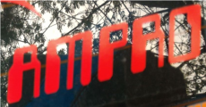
Identified font: Block Extra Cond
Edited on Oct 06, 2016 at 11:45 by donshottype


Your vintage book cover is embossed with Invitation Shaded by Morris Fuller Benton, published by American Typefounders in 1917
Partial sample from the ATF Specimen Book of 1917

AFAIK no digital
Partial sample from the ATF Specimen Book of 1917
AFAIK no digital
Identified font: Invitation Shaded
Could perhaps be a company logo made by editing Data Seventy
Edited on Oct 05, 2016 at 16:57 by donshottype
Suggested font: Data Seventy
Edited on Oct 05, 2016 at 16:57 by donshottype

Identified font: Park Avenue
All times are CEST. The time is now 09:06
