
Forum
16,067 posts Identified fonts Requests only
Posts by frd


Identified font: Antique Olive Nord Outline
Obviously not a font, but you might get a similar flavor here :
http://www.dafont.com/fr/theme.php?cat=604
http://www.dafont.com/fr/theme.php?cat=604

You're welcome 


Identified font: Sho LTStd Roman
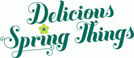
Identified font: Buttermilk

Identified font: Senator Tall

Identified font: Engravers' Gothic

Identified font: Trade Marker OT-Fat

Identified font: Eckmann
+1 pour Ubuntu !
Yup, Resonance Bold much better than Timbre 


 )
)
I wouldn't say it's a font, the "L" and the "A" look pretty different to me.

Take a look here : http://new.myfonts.com/WhatTheFont/forum/case/84436/
All times are CEST. The time is now 10:07
