
Forum
3,821 posts Identified fonts
Posts by donshottype

AFAIK this is not a font. Note in particular that the _M_ looks like it has different roots than the other letters, which can be approximated by individual letters from various metal type era formal scripts. So far, I have not found a font that contains all of the lower case letters.
Maison 140 is the logo and exterior signage letters for former home of silent film stars Dorothy and Lillian Gish, re-purposed as a boutique Beverly Hills hotel with interior design by Kelly Wearstler Interior Design. https://en.wikipedia.org/wiki/Kelly_Wearstler
Perhaps she, or the current owners of the hotel, would be able to say what, if any, fonts were the inspiration for the various letters in _Maison_.
Edited on Jan 03, 2017 at 12:24 by donshottype

AFAIK Casady & Greene's Kells [1988] predates Gandalf and Stonehenge.
All are essentially the same.
Edited on Dec 30, 2016 at 14:28 by donshottype
All are essentially the same.
Suggested font: Kells
Edited on Dec 30, 2016 at 14:28 by donshottype

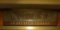
So far no match to any of the usual suspects.
Has a retro look like embossed lettering on an old book cover.
Has anyone else found it?
Edited on Dec 27, 2016 at 23:59 by donshottype
Has a retro look like embossed lettering on an old book cover.
Has anyone else found it?
Edited on Dec 27, 2016 at 23:59 by donshottype

Previous discussions have suggested that this is a proprietary font derived from
ITC Stone Sans SemiBold, which is similar but not identical to the letters in the image. Larger scale image:

ITC Stone Sans SemiBold, which is similar but not identical to the letters in the image. Larger scale image:
Suggested font: Stone Sans SemiBold

Custom, but resembles the heavier weights of ITC Souvenir when manually compressed
Suggested font: ITC Souvenir
Legitimate source of Parchment:
https://www.microsoft.com/typography/fonts/font.aspx?FMID=1013
Packaged with Microsoft Office and other Microsoft products.
Edited on Dec 21, 2016 at 22:31 by donshottype
https://www.microsoft.com/typography/fonts/font.aspx?FMID=1013
Packaged with Microsoft Office and other Microsoft products.
Edited on Dec 21, 2016 at 22:31 by donshottype

Two points.
1. Lettering on book covers in the early decades of the 20th century, and before, were custom designs by lettering artists and usually did not reference a specific font.
2. The letter forms in this book cover reflect the lettering styles of the 1890s and 1900s rather than the 1930s. Perhaps this is a reprint?
The letters in the title are a pastiche of different styles. Creating something similar would require the excerpting of letters from various sources and editing to harmonize weight etc.
For _a_, _h_, _m_ and _s_ Verona TS Extralight is in the ballpark.
Suggested font: Verona TS Extralight

Ravel might be closer -- it has the same brush stroke style for _u_ and _m_, but is far from identical.
Suggested font: Ravel
So far I have not found a single font has this particular combination of wide and narrow letters.
Yasashii Hairline Bold has similar _O_, _B_, _S_ and the top loop of _R_.
Yasashii Hairline Bold has similar _O_, _B_, _S_ and the top loop of _R_.
Suggested font: Yasashii Hairline Bold
Here are the boxy Art Deco letters, that I extracted from a photograph of the facade of the Bloomingdales NYC building, completed in 1930. I applied some perspective correction and packed them together so that the width of this image would not be unweildy.

Love the sassy _S_.
Seems like a DIY project to duplicate the letters.
Love the sassy _S_.
Seems like a DIY project to duplicate the letters.
Dremie is a good suggestion.
Anchor Jack would also work as a substitute, particularly if the curves were given boxy corners.
AFAIK there is no font that closely matches the BLOOMINGDALE'S sign.
Anchor Jack would also work as a substitute, particularly if the curves were given boxy corners.
AFAIK there is no font that closely matches the BLOOMINGDALE'S sign.
Suggested font: Anchor Jack
Custom lettering in a Spenserian style.
Redesign of the Saks logo
http://www.pentagram.com/#/projects/87099
Redesign of the Saks logo
http://www.pentagram.com/#/projects/87099
A modification of a 19th century design called Egyptian.
Note the filled in terminals with a single serif on _G_, _S_ and the top of _C_, found in some fonts such as Alfa Slab One, which is a free Google Web Font.
Similar, but not a match.
To make a substitute for GERALDINE you could modify Girga -- suggested by APlaPi -- to have similar filled in terminals for _G_, _S_ and the top of _C_, and modify the bottom terminal of _C_
Suggested font: Alfa Slab One
Difficult to say for certain at this scale, but Tall Abbey seems very close, or perhaps a match.
All times are CEST. The time is now 22:49
