
Forum
3,821 posts Identified fonts
Posts by donshottype


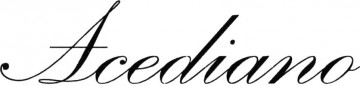
Script Bold, originally published by Monotype Corporation in 1931.
The Cincinnati Reds Wordmark Logo uses a clean and precisely engineered version that matches the Monotype digitization
Swash is a custom addition.
The Cincinnati Reds Wordmark Logo uses a clean and precisely engineered version that matches the Monotype digitization
Swash is a custom addition.
Identified font: Script Bold
You can purchase a vector called German Gothic that is an exact match to your image at
http://www.fotosearch.com/CSP369/k18016722/
http://www.fotosearch.com/CSP369/k18016722/

Some free similar fonts here at Dafont:
Grobe Deutschmeister
http://www.dafont.com/grobe-deutschmeister.font
Potsdam
http://www.dafont.com/potsdam.font
Blankenburg
http://www.dafont.com/blankenburg.font
Edited on Mar 10, 2017 at 10:24 by frd
Grobe Deutschmeister
http://www.dafont.com/grobe-deutschmeister.font
Potsdam
http://www.dafont.com/potsdam.font
Blankenburg
http://www.dafont.com/blankenburg.font
Suggested font: Grobe Deutschmeister
Edited on Mar 10, 2017 at 10:24 by frd
URW's Charter Oak is a digital version
Charter Oak was originally produced by the Keystone Type Foundry, which operated in Philadelphia from 1888-1917.
Charter Oak is shown on in their 1906 specimen book https://archive.org/details/abridgedspecimen00keysrich at pages 143 to 145.
As you note the font was popular for bus signage in the 1960s.
Identified font: Charter Oak
Custom logo, no close substitute.
See previous discussion
http://www.dafont.com/forum/read/270683/font-name-on-freschco
See previous discussion
http://www.dafont.com/forum/read/270683/font-name-on-freschco

Chevalier is offered by Letter Perfect in a sightly narrower version that seems the best match of the suggestions so far for the proportions of the solid DOMAINE DES NUGUES letters.
In its present form -- with stripes -- Chevalier LP is NOT THE FONT.
Edited on Mar 06, 2017 at 21:30 by donshottype
In its present form -- with stripes -- Chevalier LP is NOT THE FONT.
Edited on Mar 06, 2017 at 21:30 by donshottype
This looks like a sold version of the corporate wine label.
Compare to:

which seems to use Chevalier
Medoc and Copperhead Condensed, while not an exact match for a solid Chevalier, are close substitutes.
In its present form -- with stripes -- Chevalier is NOT THE FONT.
Edited on Mar 06, 2017 at 21:30 by donshottype
Compare to:
which seems to use Chevalier
Medoc and Copperhead Condensed, while not an exact match for a solid Chevalier, are close substitutes.
In its present form -- with stripes -- Chevalier is NOT THE FONT.
Suggested font: Chevalier
Edited on Mar 06, 2017 at 21:30 by donshottype

Hohenzollern by A. Fahrenwald for Bauersche Giesserei, Frankfurt, 1902, as shown in Ludwig Petzendorfer's _Authentic Art Nouveau Alphabets..._ Link to a scan by Luc Devroye of Petzendorfer's image:
http://luc.devroye.org/Bauersche-Hohenzollern.jpg
There is a digital version here at Dafont
Edited 2 times. Last edit on Mar 06, 2017 at 17:19 by donshottype
http://luc.devroye.org/Bauersche-Hohenzollern.jpg
There is a digital version here at Dafont
Identified font: CAT Hohenzollern
Edited 2 times. Last edit on Mar 06, 2017 at 17:19 by donshottype

Old English Regular, the name Monotype used for a design different from others with similar names such as "Old English", "Old English Engraved" etc.
Edited on Mar 04, 2017 at 15:31 by donshottype
Suggested font: Old English Regular
Edited on Mar 04, 2017 at 15:31 by donshottype
Looks like a butchered version of the design used in English Town, which is a free version at Dafont of Old English Regular.
Edited on Mar 04, 2017 at 12:07 by donshottype
Suggested font: English Towne
Edited on Mar 04, 2017 at 12:07 by donshottype

Identified font: Varsity

Have not found a font that is a close match to this English style textura.
For a very approximate substitute you could use Amador, especially for the lower case.
For a very approximate substitute you could use Amador, especially for the lower case.
Suggested font: Amador

A little on the light side and lacks the angled crossbars on _A_ and _H_.
Use two letters _V_ overlapped for _W_.
Use two letters _V_ overlapped for _W_.
Suggested font: Air Corps

Diploma lettering in the blackletter style seems to have developed from old engraved diplomas.
Not much in the way of matching fonts.
Inland Type Foundry had a font circa 1900 that was someahat similar under the name Shaw Text

No digital available for purchase or download.
Not much in the way of matching fonts.
Inland Type Foundry had a font circa 1900 that was someahat similar under the name Shaw Text
No digital available for purchase or download.
That's it  The _C_ [Cyrillic _S_] is indeed lifted from De Vinne [aka Denver] with a custom highlight.
The other letters could perhaps match a Didone or Bodoni from Paratype or Parachute, using a Latin _K_.
Edited on Feb 28, 2017 at 19:55 by donshottype
 The _C_ [Cyrillic _S_] is indeed lifted from De Vinne [aka Denver] with a custom highlight.
The other letters could perhaps match a Didone or Bodoni from Paratype or Parachute, using a Latin _K_.
Edited on Feb 28, 2017 at 19:55 by donshottype
Looks squeezed in width.
When width is doubled, it looks like:

A small cove serif Didone or Bodoni with an unusal _C_ [Cyrillic _S_].
But I still can't place it
Edited on Feb 28, 2017 at 17:43 by donshottype
When width is doubled, it looks like:
A small cove serif Didone or Bodoni with an unusal _C_ [Cyrillic _S_].
But I still can't place it

Edited on Feb 28, 2017 at 17:43 by donshottype

Identified font: Walbaum Antiqua DemiBold
All times are CEST. The time is now 12:02
